Fintech mobile app onboarding checklist: how to design it for better conversion and user trust
Updated at
11.05.2026
TL;DR
A strong fintech onboarding flow removes guesswork at every step. It sets clear expectations from the outset, requests only essential data, and explains sensitive actions in plain language. Users stay oriented throughout the process rather than being left without feedback. As a result, they retain control, complete sign-up more often, and are less likely to drop off during KYC, because the experience remains predictable.
Fintech mobile app onboarding | 01:35 min
No time to read? Explore in audio right at work, at home, or on the go.
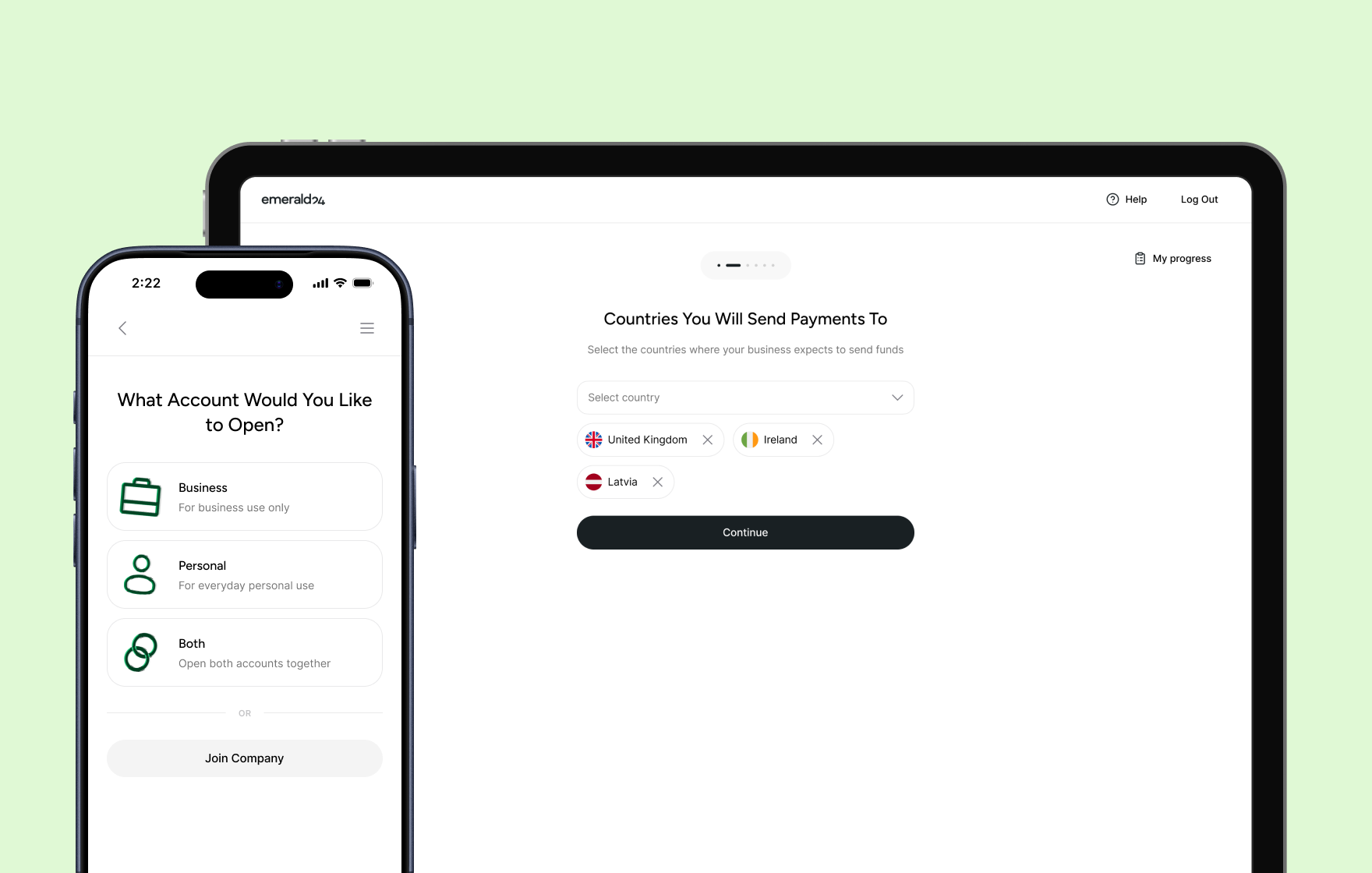
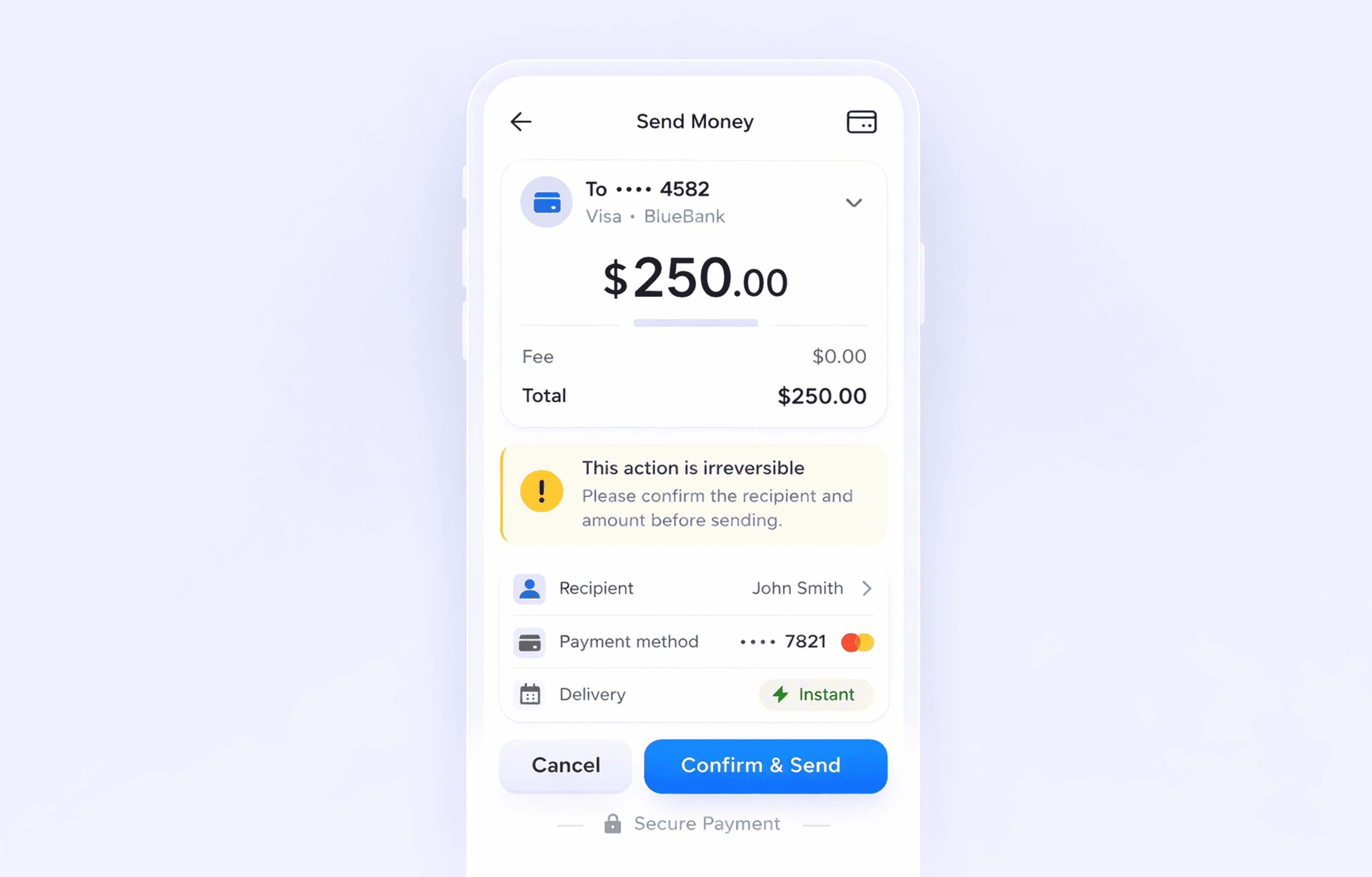
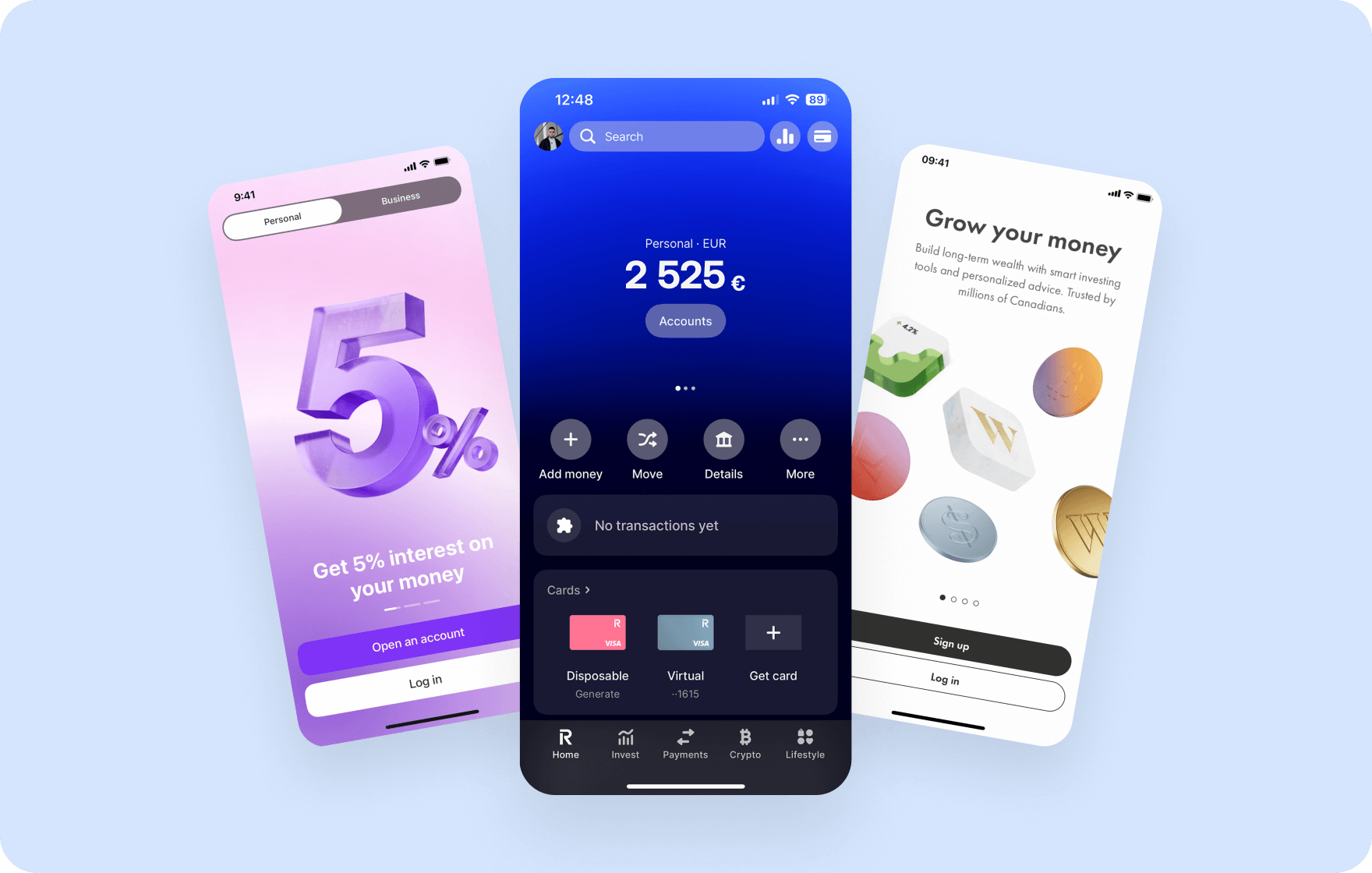
Redesigned onboarding for Emerald24 digital bank by Goodface agency.
(Browse the full case study)
Major industry stats show that more than half of users drop off before they finish onboarding in fintech products. The pattern stays consistent across regions and product types, and recent industry data confirms the scale of the problem.
For example, Fenergo’s 2025 research found that 70% of financial institutions lost clients due to slow or inefficient onboarding in the past year, up from 67% in 2024 and 48% in 2023.
Signicat’s long-running Battle to Onboard study shows a similar direction from the user side — 68% of consumers have abandoned a financial onboarding process, with rates rising steadily over time.
Business users often move through a process that feels difficult, slow, and fragmented. They fill out lengthy forms, upload the same documents multiple times, and move through compliance steps without clear explanations.
At the same time, verification systems run in the background, but users don’t see what happens behind the scenes. That gap creates the real issue. It’s not the number of steps or the complexity itself — it’s the absence of feedback. Users become unaware of what happens to their data next.
Why fintech onboarding is sophisticated
Fintech onboarding brings together elements that rarely sit within a single flow:
identity verification → financial data collection → external system checks → user hesitation.
All of this happens before users experience any real value. In addition, that combination creates constraints you can’t remove, and only design around.
A user opens the app and, within minutes, moves through a sequence like this:
- Share sensitive personal information
- Upload identity documents to confirm
- Wait for verification approval or denial
At this point, the product still hasn’t delivered anything useful. Users only invest time & effort. That imbalance sets the foundation for most onboarding problems.
Where fintech onboarding UX breaks
Breakdowns don’t spread evenly. They appear at moments where users lose context or control.
Common failure points:
- The first form feels longer than expected.
- Document upload offers no guidance or feedback.
- The system pauses without explaining what happens next.
- Verification fails, and the flow offers no clear recovery path.
These moments shape most UX design issues in fintech onboarding. In practice, users don’t leave because the flow exists. They leave because they no longer understand it.
What a strong onboarding flow needs to achieve
First, you need to step away and dive deeper into the user psychology before installing any fintech app. It’s not about the entertainment or distraction between work and study. It’s a place for saving & exchanging their money, storing sensitive data, and forming specific financial behaviour.
A strong fintech mobile app onboarding doesn’t try to do everything at once. It focuses on three outcomes that keep users moving forward without confusion or hesitation.
1. Help users understand value quickly
Users don’t arrive with patience. They arrive with doubt. They ask one question immediately: “What do I get from this?”
If onboarding starts with forms, users lose interest before they see value. If it starts with context, users stay long enough to commit.
Strong flows:
- show a clear outcome before asking for effort
- connect actions to real benefits, not abstract promises
- reduce uncertainty about what happens next
When users understand value early, they stop scanning for risks and start moving through the flow.
2. Reduce challenges without losing transparency
Users don’t leave because onboarding takes time. They leave because they feel stuck or confused.
Every extra input, unclear label, or unexplained step increases mental load. That load builds hesitation, and hesitation breaks momentum.
Good onboarding respects attention by asking for information only when the system needs it → without forcing users to think about what comes next → and keeps each interaction simple enough to complete without effort.
Clarity matters more than speed. When users feel in control, they accept longer flows.
3. Build speed, trust, and compliance
This is one of the most challenging parts to balance. On the one hand, fintech mobile apps operate under non-negotiable regulatory constraints that companies should follow. On the other hand, you have meticulous users who want fast access, an effortless experience, and a predictable system.
Trust forms when users feel that these forces work together instead of against them. If a flow feels rushed, users doubt safety. If it feels slow or unclear, users lose patience.
Strong onboarding creates balance:
- it keeps a steady pace instead of rushing users through critical steps
- It explains sensitive moments in a way that feels clear, not heavy
- It frames required checks as a normal part of the journey, not a surprise
When users trust the process, they stay engaged even when verification takes time or the system needs to pause.
If your fintech onboarding flow feels fragmented, slow,
or unclear, let's discuss your product challenges!
Here are the 10 fintech app onboarding best practises
Step 1 — Set expectations before onboarding starts
Before users enter the flow, reduce uncertainty and outline the next steps.
A simple intro screen can answer three key questions:
- How long will this take?
- What do I need to prepare?
- What do I get at the end?
For example:
- “Takes about 3–5 minutes.”
- “You’ll need your ID card.”
- “Get your virtual card right after signup.”
This small step often improves completion because users know what they’re committing to.
Step 2 — Reduce friction in the first interaction
The first screens determine whether users continue. Instead of asking for everything up front and overwhelming users, focus on momentum and collect only essential data, keep one action per screen, display approximate wait times, and avoid early duplications or branching choices.
Most finance app onboarding happens on mobile, so even small frictions — too much typing, swiping, switching screens — have a significant impact on the general experience. So if you have an option to pre-fill or automate something — do it. Because any extra microaction matters.
Step 3 — Build trust through clarity
Trust doesn’t come from branding. It comes from understanding.
When asking for sensitive data:
- explain why you need it
- use direct, plain, and simple language
- place explanations next to inputs, not in separate screens
For example, a short line like: “We verify your identity to protect your account” often works better than long legal text that eats up minutes to process and catch its sense.
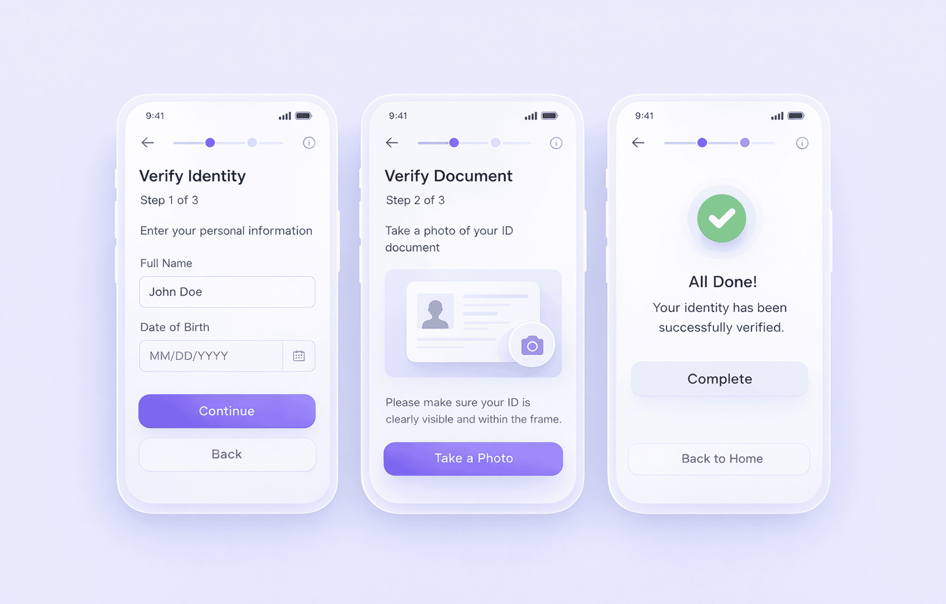
Step 4 — Break down identity verification
KYC is one of the hardest parts of onboarding — mostly because it’s often presented as one heavy step that demands superhuman effort.
A clearer KYC UX design structure works better:
- Basic information
- Document upload
- Confirmation (selfie or check)
Guide and contain each step to help users feel easier. Before asking for any attachments, draw up clear instructions for users, e.g, “to upload your passport, add good lighting, with no glare, making the full document visible.” If something fails, don’t stop the flow. Explain to users what exactly went wrong and how to fix it.
Step 5 — Inform users at all times
Uncertainty is one of the main reasons users leave. You reduce it with simple signals like progress indicators (steps or percentage), real-time validation, and clear, specific error messages
Instead of: “Error occurred”, “Failed to proceed”, inform users in detail, guiding them to the successful pass: “Photo is too dark. Try again with better lighting.” Such microcopy adds context and reduces anxiety.
Step 6 — Make consent readable and structured
Consent is required, but it doesn’t have to slow users down. Instead of long blocks, break content into sections, separate required and optional permissions, and summarise key points in plain language. Users don’t need legal details at this stage. They need clarity and simplicity.
Step 7 — Reduce input effort on mobile
In fintech today, most users don’t sit at a desktop when they sign up. They start onboarding on a phone, often in a moment of distraction — on the move, between tasks, or during a quick break. That changes how the flow needs to behave.
Mobile-first nudging means guiding users step by step instead of showing long forms. The product uses the phone’s built-in tools and reduces effort at every stage. You build small, clear actions that keep momentum, and replace manual input where possible:
- Use context-aware prompts based on where the user is in the flow
- Use device features like camera, biometrics, and autofill instead of manual input
- Split onboarding into short steps that fit a single screen action
- Show progress in a simple way (step counter or light progress bar)
- Let users pause and continue later without losing data
The goal is simple: keep each step light, clear, and easy to complete on a phone.
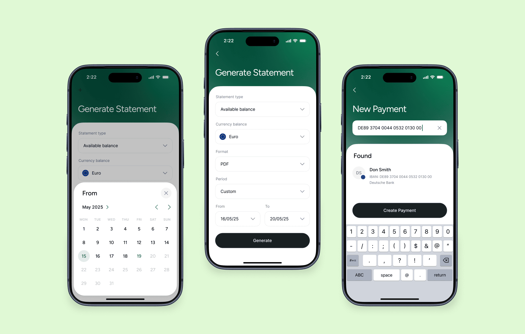
Emerald24 digital banking account statement
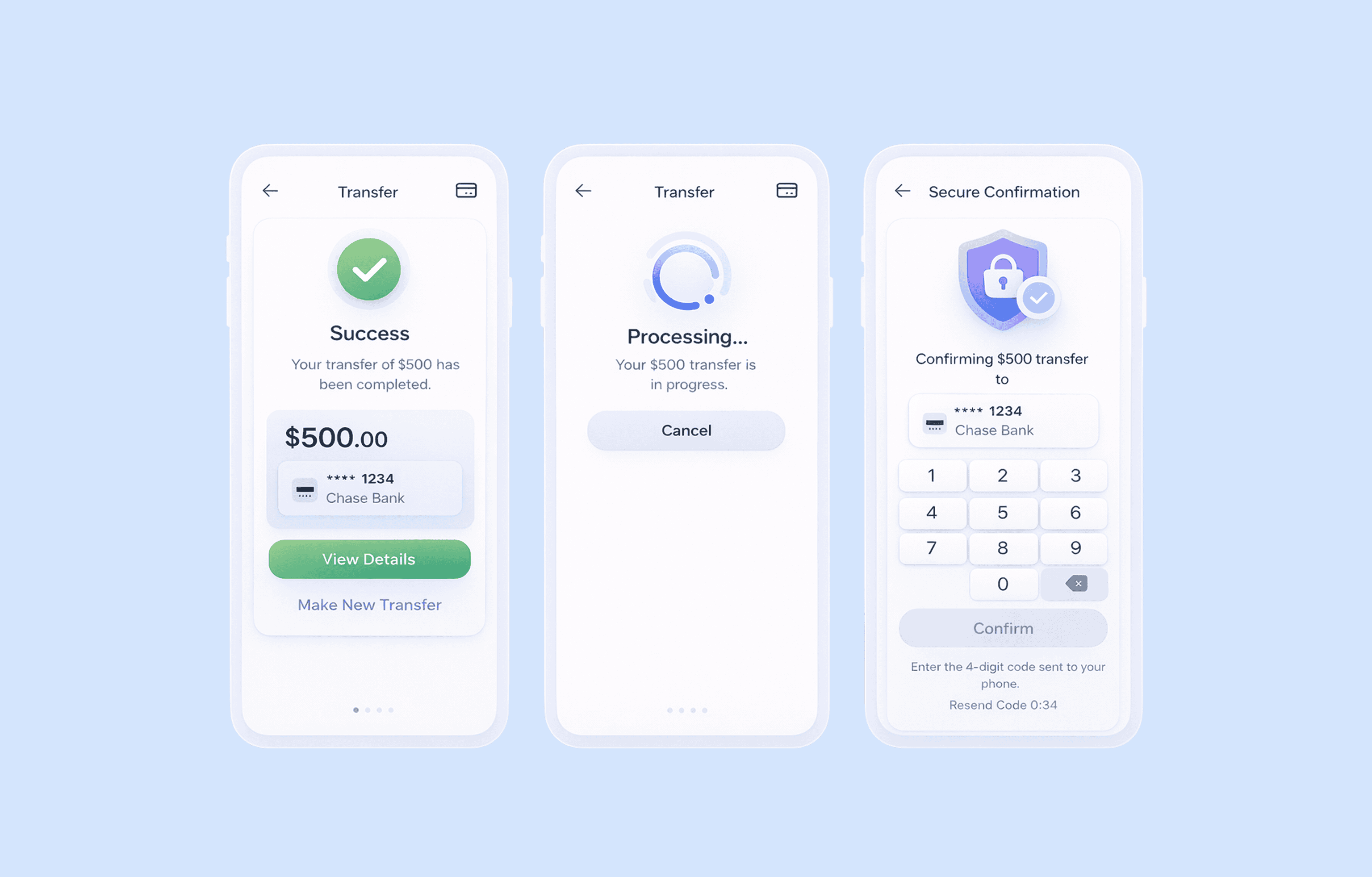
Step 8 — Explain security steps in context
Security always breaks the flow. Users pause, even if the step is expected. The goal isn’t to hide these moments, but to make them feel natural and predictable.
When a security step appears (OTP, passcode, biometrics), the interface should answer three things instantly:
→ Why does this step appear now
→ What happens right after
→ What it protects
For example, a short line like “This code helps secure your account before activation” gives enough context to keep users moving. Without this, users don’t see protection — they see interruption.
Step 9 — Plan for interruptions
Users rarely complete onboarding in one go. They get distracted, switch devices, or stop at the verification step. If the flow assumes full completion in one session, it loses a large share of users.
A better approach treats interruption as part of the journey:
- save progress at every step, not just at milestones
- let users return directly to where they stopped
- send reminders only when they match user intent (e.g., after a failed step, not randomly)
This becomes critical in longer KYC onboarding fintech flows, where delays and pauses are part of the process, not exceptions.
Step 10 — Lead users to the first action after onboarding
Onboarding doesn’t end at account creation — it must transition users into the next step to support engagement. If users complete onboarding but don’t know what to do, the flow breaks at the final step.
A strong finish looks like this:
- user completes verification
- lands on a guided screen (not a neutral dashboard)
- sees a clear next action
- completes their first meaningful task
What counts as “first value” depends on the product; it may be the first transfer, first card activation, first balance view, or first payment setup — the key isn’t the feature itself, but how clearly it’s presented.
To make this work:
- highlight one primary action, not multiple options
- explain what the user can do right now
- remove any extra steps between onboarding and action
If onboarding ends without direction → users pause → momentum drops → many don’t return
If it ends with a clear path forward→ users act immediately → confidence increases → retention starts forming from the first session
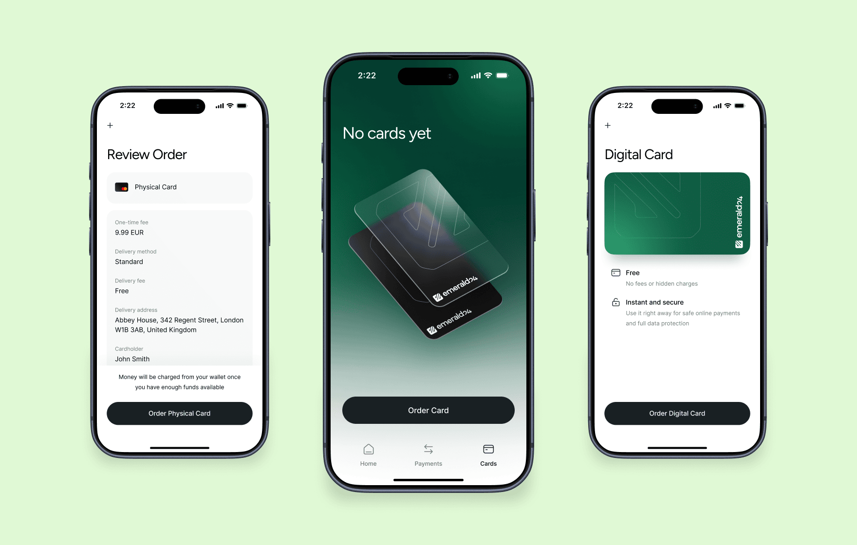
Emerald24 neobank menu for ordering physical and virtual cards
Fintech mobile app onboarding checklist
Use this checklist to review whether your onboarding flow supports clarity, trust, and completion — not just whether it “works” technically. A strong checklist doesn’t just measure completion. It shows where users lose confidence, context, or momentum.
- Do users understand why onboarding exists before they start the flow (not only during it)?
- Do you connect onboarding steps to a clear outcome users actually care about (account access, card, transfers)?
- Do you explain each data request in plain language, or does it appear in separate screens or legal blocks?
- Do users always know what will happen next after each step (no hidden or unclear transitions)?
- Does the flow avoid unnecessary repetition of inputs or document requests across steps?
- Do users see progress in a way that reflects real completion (not just decorative indicators)?
- Does the system reduce uncertainty during waiting states (verification, processing, review)?
- Can users pause and return without losing context, re-entering data, or restarting steps?
- Do error states explain what went wrong and give a direct path to fix it instead of stopping the flow?
- Does the onboarding adapt to mobile behaviour (short sessions, interruptions, limited input effort)?
- Do users reach their first meaningful action immediately after onboarding, without an extra decision layer?
- Can product teams identify exactly where users drop off and why (not just overall completion rate)?
Have a similar project? Let's create the best onboarding experience for your fintech product!
FAQ
What is fintech app onboarding?
Fintech app onboarding is the process that takes a user from first app open to an active account. It usually includes registration, identity verification (KYC), and initial setup.
The goal is not just account creation, but reaching a point where the user can actually use the product.
Why is onboarding more complex in fintech apps?
Fintech onboarding combines several constraints in one flow:
- users must share sensitive personal and financial data
- products must comply with KYC and AML regulations
- external systems (banks, verification providers) affect timing
This makes onboarding harder to simplify compared to typical apps.
How can fintech onboarding improve conversion?
Conversion improves when users don’t feel stuck or confused.
Strong flows:
- explain each step clearly
- reduce unnecessary input
- guide users through verification
- lead directly to first action
→ clarity and momentum drive completion, not just fewer steps.
What makes fintech apps different
Three forces shape every onboarding flow, whether teams design for them or not:
- Trust comes first → users evaluate risk before they see value
- Compliance stays fixed → KYC and AML define mandatory steps
- External systems slow things down → banks and verification tools add delays
You can’t remove these limits, but you can decide how clearly the product communicates them.
Why do users abandon fintech onboarding?
Most users drop off at predictable points:
- long or unclear forms
- document upload without guidance
- delays with no explanation
- failed verification without recovery
→ users leave when they lose understanding or control of the process.
What are the most important trust signals in onboarding?
Users look for reassurance at the moment they share data.
Effective signals include:
- short explanations of why data is required
- clear security messaging near inputs
- visible progress and status updates
→ trust forms through clarity, not just visual design.
What should happen after onboarding is complete?
Onboarding should lead directly to a meaningful action:
- sending a transfer
- activating a card
- viewing account balance
→ users should not land on an empty dashboard or guess what to do next.
How long should fintech onboarding take?
Most successful flows aim for a few minutes, but time matters less than clarity.
Users accept longer onboarding if:
- they understand each step
- progress is visible
- the outcome is clear
→ perceived effort matters more than actual duration.
How do you design onboarding for mobile users?
Mobile onboarding should reduce effort and keep momentum.
This includes:
- minimizing typing
- using device features (camera, biometrics)
- breaking tasks into small steps
- allowing users to pause and return
→ the flow should fit short sessions and real-world interruptions.
Read more

product experience

for your project
get in touch
Fill out the form
or brief with questions

PRIVACY POLICY
Welcome to Goodface privacy notice.
Goodface respects your privacy and is committed to protecting your personal data. This privacy notice will inform you as to how we look after your personal data when you visit our website (regardless of where you visit it from) and other sites we own and operate. And tell you about your privacy rights and how the law protects you.
We may change the privacy policy from time to time to reflect changes to the products and services that we provide and how we process your personal data.
We will not share your information with any third party outside of our organization, other than as necessary to fulfil your request if any."
INFORMATION WE COLLECT
When you visit our website, our servers may automatically log the standard data provided by your web browser. This data is considered “non-identifying information”, as it does not personally identify you on its own. It may include:
- Your computer’s Internet Protocol (IP) address;
- Your browser type and version;
- The pages you visit;
- The time and date of your visi;
- The time spent on each page;
OTHER DETAILS
We may ask for personal information, such as your name and email address. This data is considered “identifying information”, as it can personally identify you. We only request personal information relevant to providing you with a service, and only use it to help provide or improve this service.
We collect information by fair and lawful means, with your knowledge and consent. We also let you know why we’re collecting it and how it will be used. You are free to refuse our request for this information, with the understanding that we may be unable to provide you with some of your desired services without it.
We will only process personal data and communicate with you if:
1. You have given us consent to the processing of your personal data and communicating for one or more specific purposes i.e. requesting products or services from us, downloading material or information from our website or submitting a contact us form.
2. Performance of a contract
3. Where we have a legitimate interest for contacting you in relation to our products and services
DATA PROCESSING AND STORAGE
We only retain personal information for as long as necessary to provide a service, or to improve our services in future. While we retain this data, we will protect it within commercially acceptable means to prevent loss and theft, as well as unauthorised access, disclosure, copying, use or modification. That said, we advise that no method of electronic transmission or storage is 100% secure, and cannot guarantee absolute data security.
Rights and choices of individuals:
- See what data we have about you, if any;
- Change/correct any data we have about you;
- Have us delete any data we have about you;
- See what security measures we apply to your data;
- Express any concern you have about our use of your data;
You may opt out of any future contacts from us at any time. You can do the following at any time by contacting us via the email address given on our website: goodface.agency

Got questions or want to discuss a project ?
?
Let's talk