

Quantum CI
Price reporting & media agency
powering the global commodity market
Industry
Expertise
Web app design services & corporate website redesign for commodity market intelligence agency
Development period
2025-2026


About the client
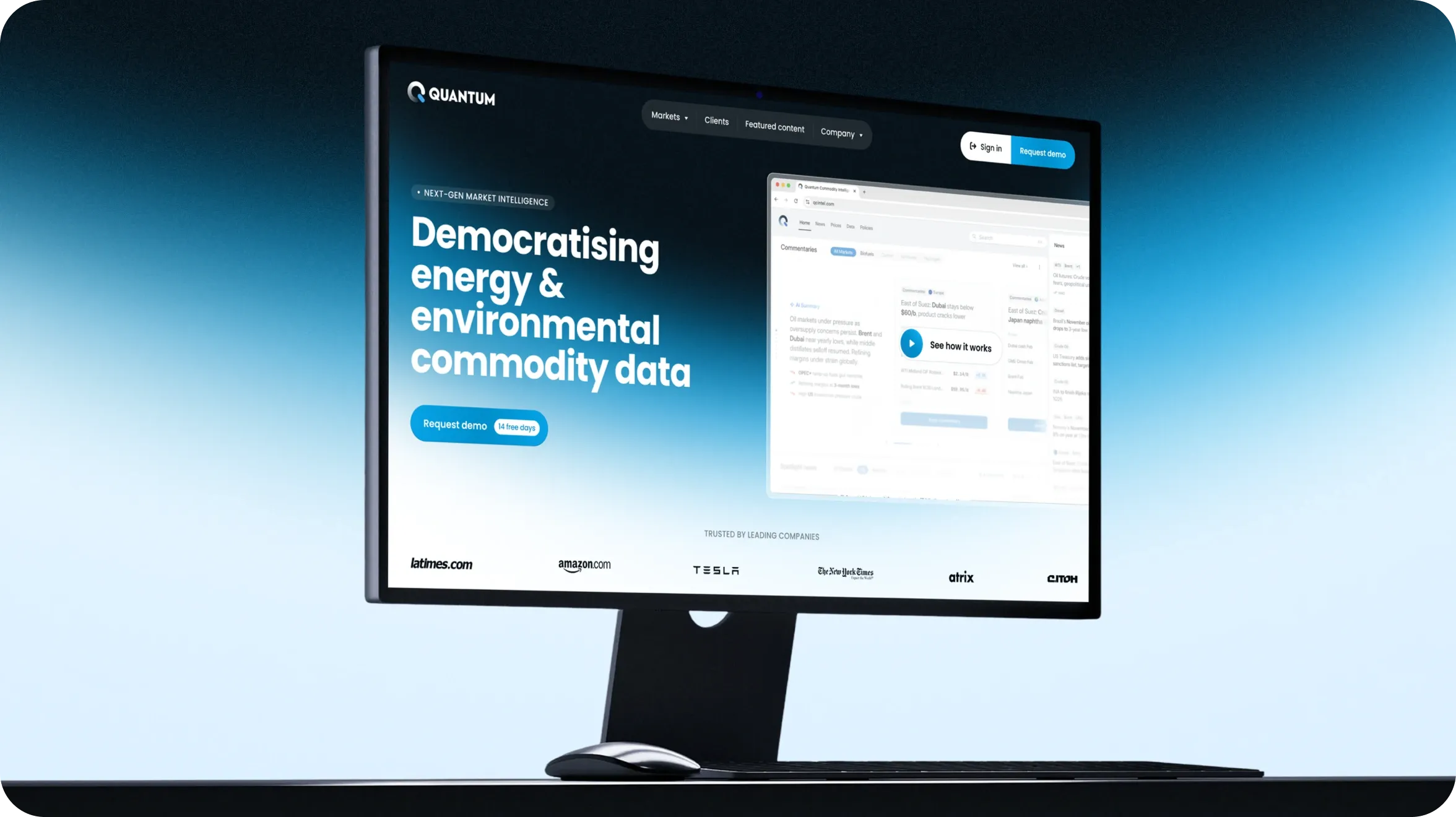
Quantum is a London-based media agency and data reporting company covering the oil, biofuel, carbon, ammonia, and hydrogen markets. It publishes daily market prices and news for industry professionals, with its price assessments used by traders as benchmarks when negotiating and closing deals.
Project challenge
Web app redesign
When the client came to us, the platform was already live, but it wasn’t working as a daily tool for traders as it needed to. The problems fell into three main categories.
Business level
80% of paying customers had never visited the platform.
The reason was simple: the daily email newsletter had become the primary way customers consumed Quantum’s content, eliminating the need to visit the platform.
The platform offered no personalization.
Users couldn’t save favorite prices, set customized alerts, or keep frequently used filters. Everyone saw the same experience, regardless of their role or market focus.
The web app looked and behaved like a WordPress news site.
Its technical foundation was visible in the interface. The experience felt more like a digital newspaper than a professional tool designed to support traders’ routine.
User experience level
Different user groups had very different usage patterns.
A trader might log in three or four times a day, while a policy consultant might visit once a week. The platform needed to support both without treating them as the same type of user.
Most customers subscribed to only one or two of the five markets.
Navigation had to make its subscribed markets easy to reach while still giving them relevant opportunities to discover and explore other markets.
The platform made basic research unnecessarily slow.
To read several articles, users had to open one, go back to the list, and open another. Price charts couldn’t be viewed side by side, making it difficult to compare markets and track differences.
Specific functional gaps
Beyond the broader UX issues, several core functions were either missing or difficult to use.
- Search — users described it as “terrible.” It only covered news, with no option to search across prices, markets, and other content.
- API feed — critical for enterprise clients, but difficult to find and poorly documented.
- Pricing methodology — users didn’t understand how price assessments were determined, making it harder to trust the data.
- Publishing holiday calendar — users had no clear way to see when market updates would not be published.
- Account management — admins couldn’t see how many active users their organization had.
- Subscription management — customers couldn’t easily tell which markets they were subscribed to or what other markets and products were available.
Project objectives
Transform the platform from a “newspaper” into a personalised daily tool for traders
Short-term project deliverables
- A modern, intuitive interface that reflects the quality and value of Quantum’s market data
- A personalised dashboard that gives each user quick access to the markets, prices, and content relevant to them
- An alerts and notifications system designed to give users a reason to return to the platform throughout the day
- A documented information architecture and UX strategy to provide a clear foundation for future product development
- A comprehensive design system that allows the platform to scale without losing consistency
Medium-term business targets
- Increase the share of paying subscribers who actively use the platform
- Increase the number of customers who set up API feeds
- Increase customer LTV by making the platform a more integral part of daily workflows
Long-term strategic ambitions
These outcomes reflect Quantum’s broader ambitions for the product and its market position, rather than results directly attributable to the redesign.
- Reinforce the standing of Quantum’s price assessments as industry benchmarks
- Create a stronger product proposition that supports a higher subscription price
- Make it easier for customers subscribed to one market to discover and subscribe to additional markets
- Strengthen Quantum’s position when negotiating distribution through well-known global platforms (under NDA)
Team Squad

Project manager

Design team lead

Product designer

UX/UI (web) designer

Motion designer
Project scope
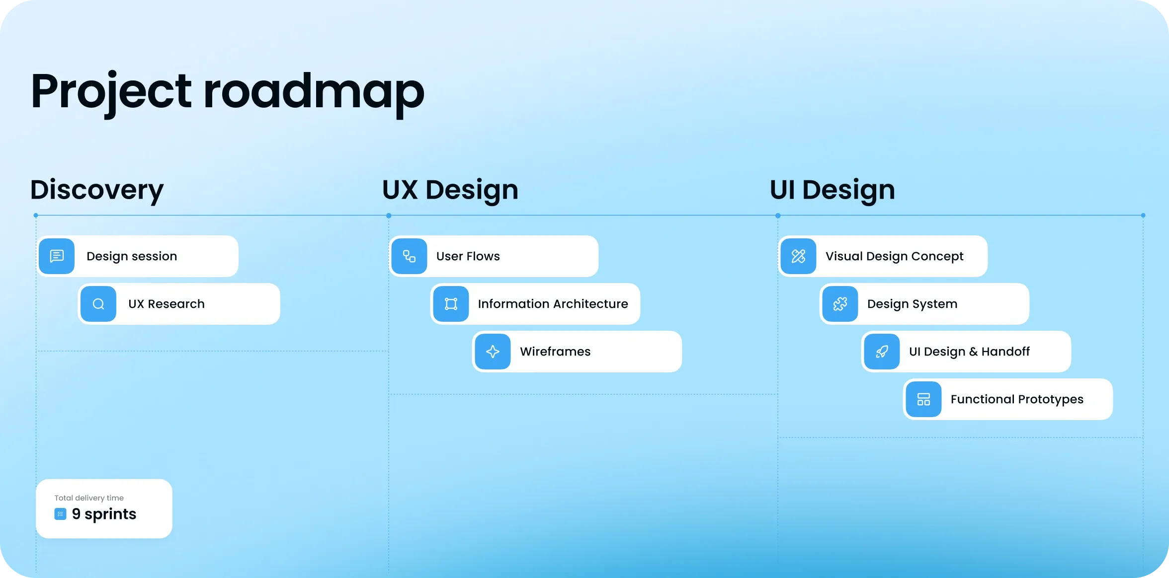
The project began with a discovery phase centered on in-depth stakeholder interviews. We spoke with people from marketing, engineering, and product leadership to understand how the existing platform worked, where it fell short, and what the redesign needed to address.
Each session lasted 60–90 minutes. We used these conversations to map the existing product, identify key gaps, and prioritize the scope before moving into UX and design.
One of the first findings was a mismatch in how the client and design team understood some of the platform’s basic concepts—including what a “dashboard” should be. The client used the term to describe a content-rich home page, while we initially understood a dashboard as a workspace with metrics and data.
That difference quickly became a design problem rather than a terminology issue. We were solving for different structures and purposes, which complicated alignment on the home page concept. It became one of the starting points for rethinking the information architecture and, eventually, reframing the “dashboard” as a personalized home page.
Discovery phase
- Stakeholder interviews — aligned expectations, surfaced hidden needs, and exposed differences in how teams understood the product
- Information Architecture audit — mapped the existing structure and identified where navigation and content organisation were creating friction
- User personas — defined six key user groups, from traders to regulators, based on their goals and usage patterns
- User flows and JTBD analysis — mapped the key tasks users came to the platform to complete
- Scope prioritisation — used the research findings to determine which problems needed to be solved first
UX ideation & wireframes
- Stakeholder workshops focused on navigation and information architecture
- Navigation wireframes to test different structural models
- Wireframes for key pages: Dashboard/Home, Articles, and Prices
- The homepage concept was refined through ~3 iterations to align expectations
- A focused UX phase: we worked through complex flows in detail, while moving simpler areas directly into high-fidelity design
Visual concept & design system
- Developed and presented the visual concept
- Integrated the existing design system library and adapted it to the new product
- Built components for both Light and Dark Modes
UI design & handoff
- Designed all key product pages
- Prepared the designs for development with a Figma handoff
- Handed screens over to development in parallel while continuing to design the next ones
Functional prototypes · Figma Make + AI
For complex, interaction-heavy flows such as the watchlist, price matrix, and policy map, static screens were not enough to validate how the solutions worked. We built four functional prototypes using Figma Make and AI. The four prototypes took less than 8 hours in total, excluding design. They became a basis for client testing and documentation for the development team.
Solutions
Personalised home page (not a dashboard design)
Stakeholders initially asked for a dashboard. We explored several directions, but none of them worked. Each iteration ended with the same response: “not quite right.” We had reached a dead end because we were solving the wrong problem.
The underlying issue was a fundamental difference in how we defined the product. We saw a dashboard as a set of metrics and charts, while the client saw it as a navigation page that brought together the platform’s content categories. As a result, the home page became one of the hardest UX issues in the project, with the concept reworked around three times before expectations aligned.
The solution came after 3+ design sessions and a simple change in terminology: we stopped calling it a "dashboard" and called it a "home page." That small shift aligned the team around what the page actually needed to do.
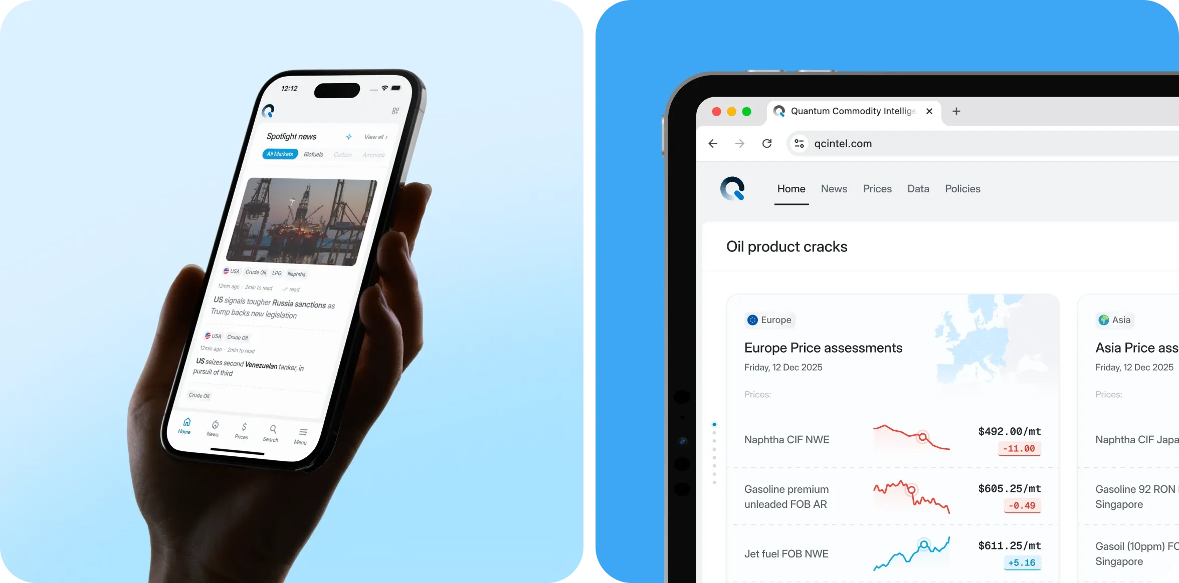
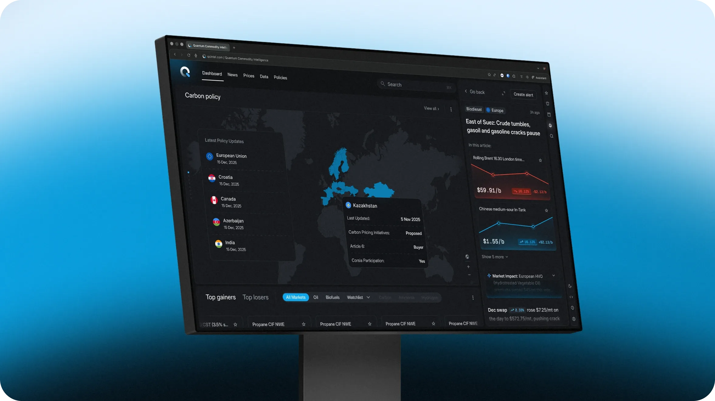
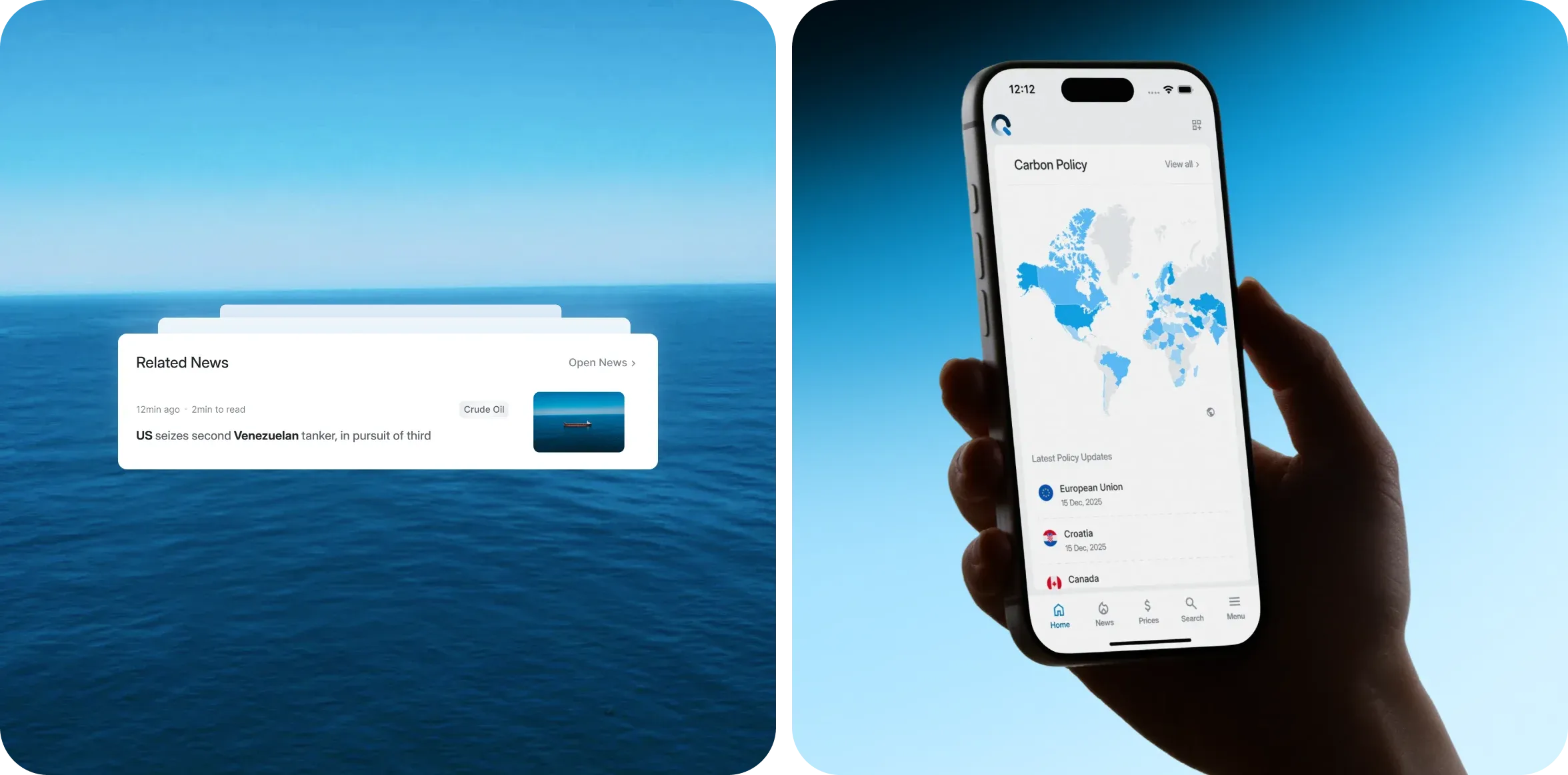
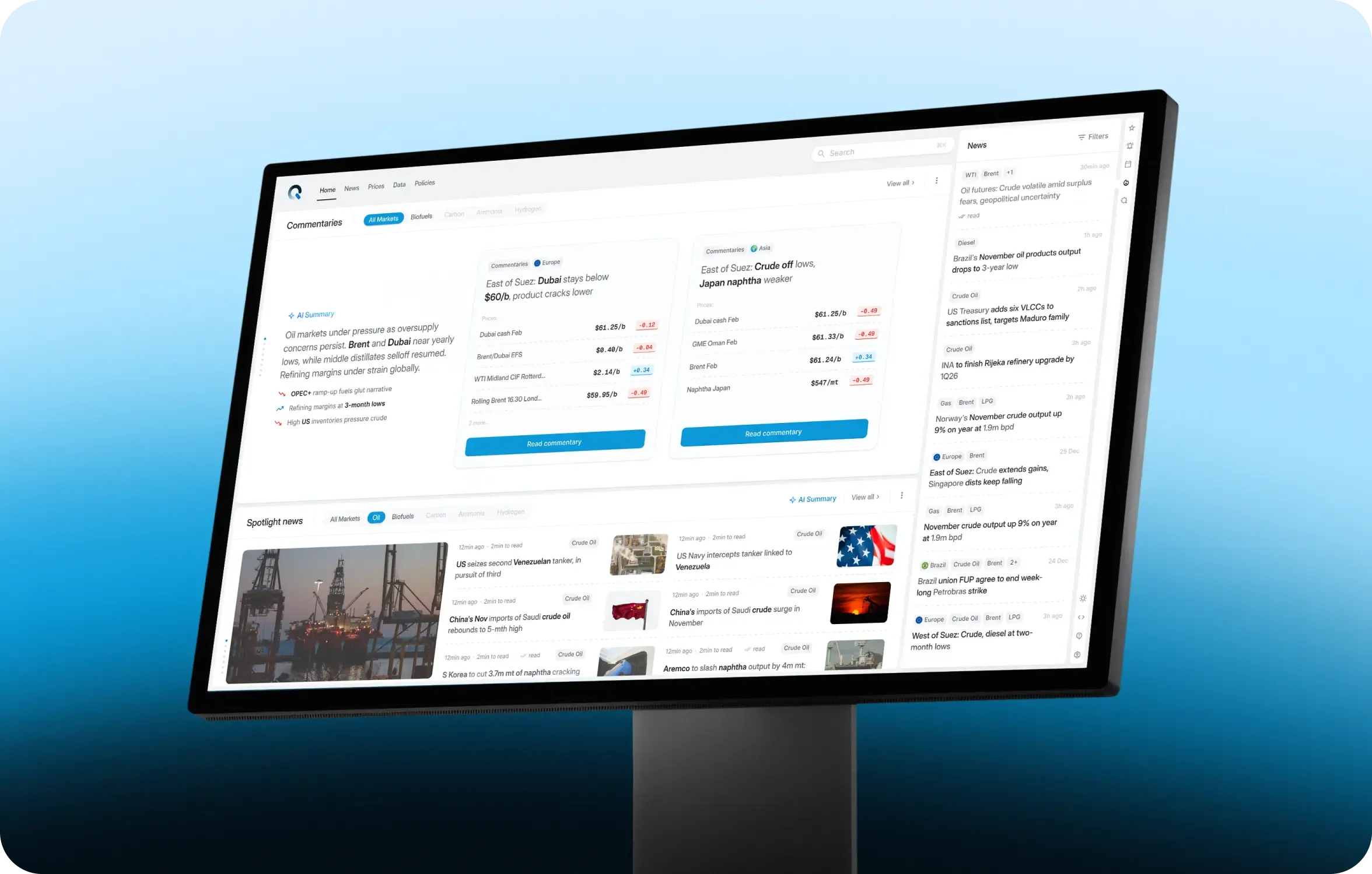
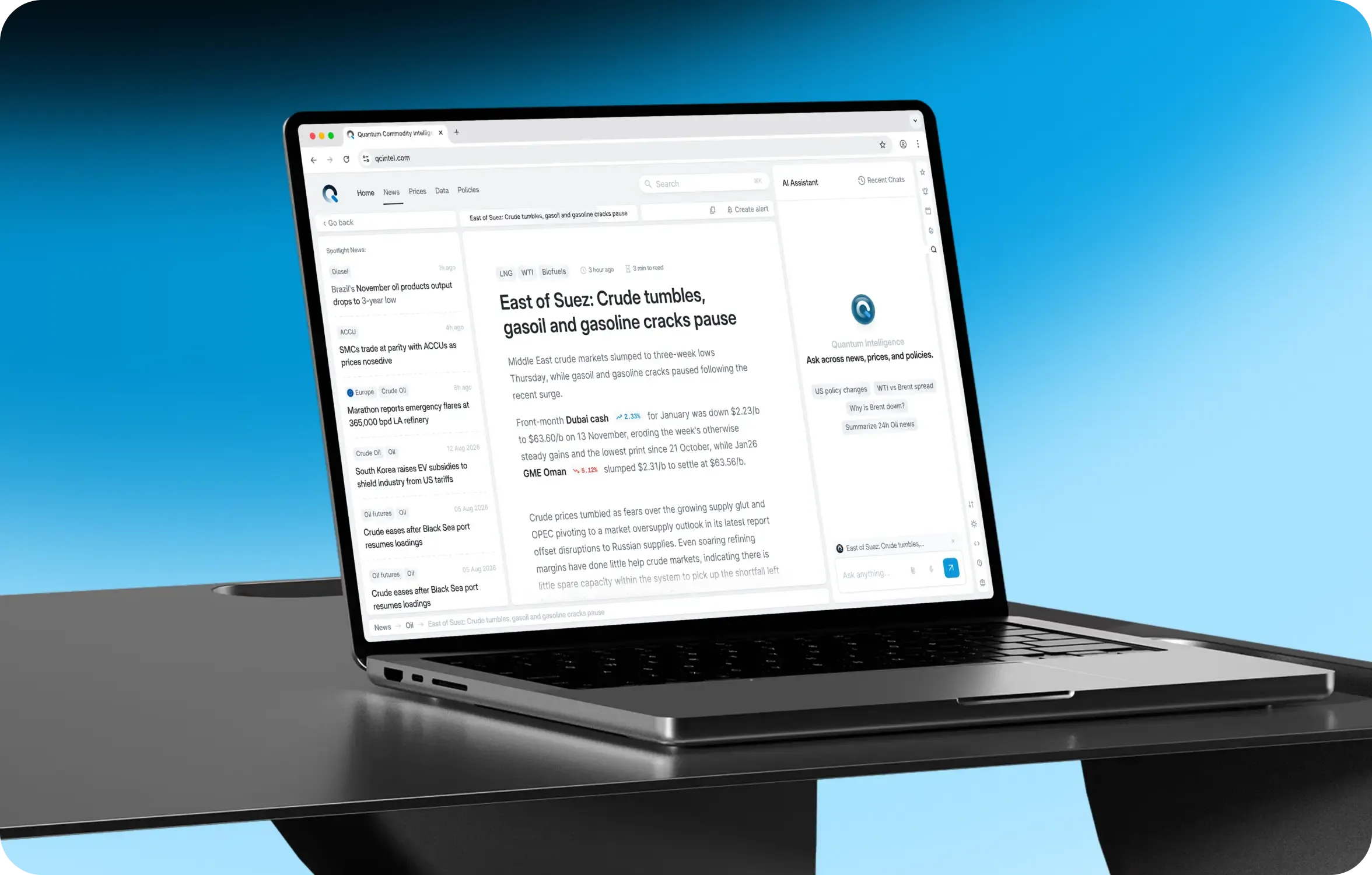
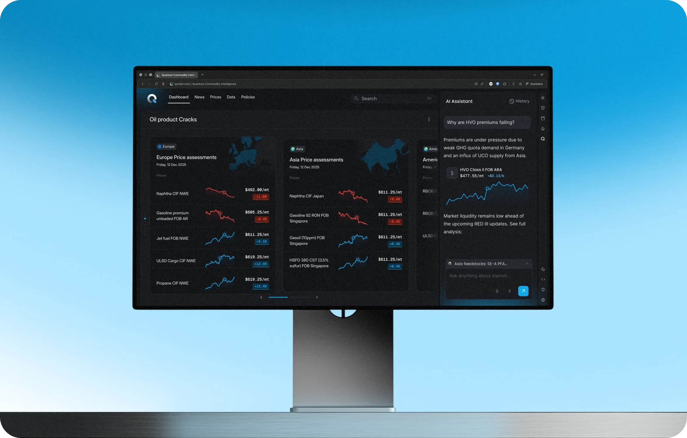
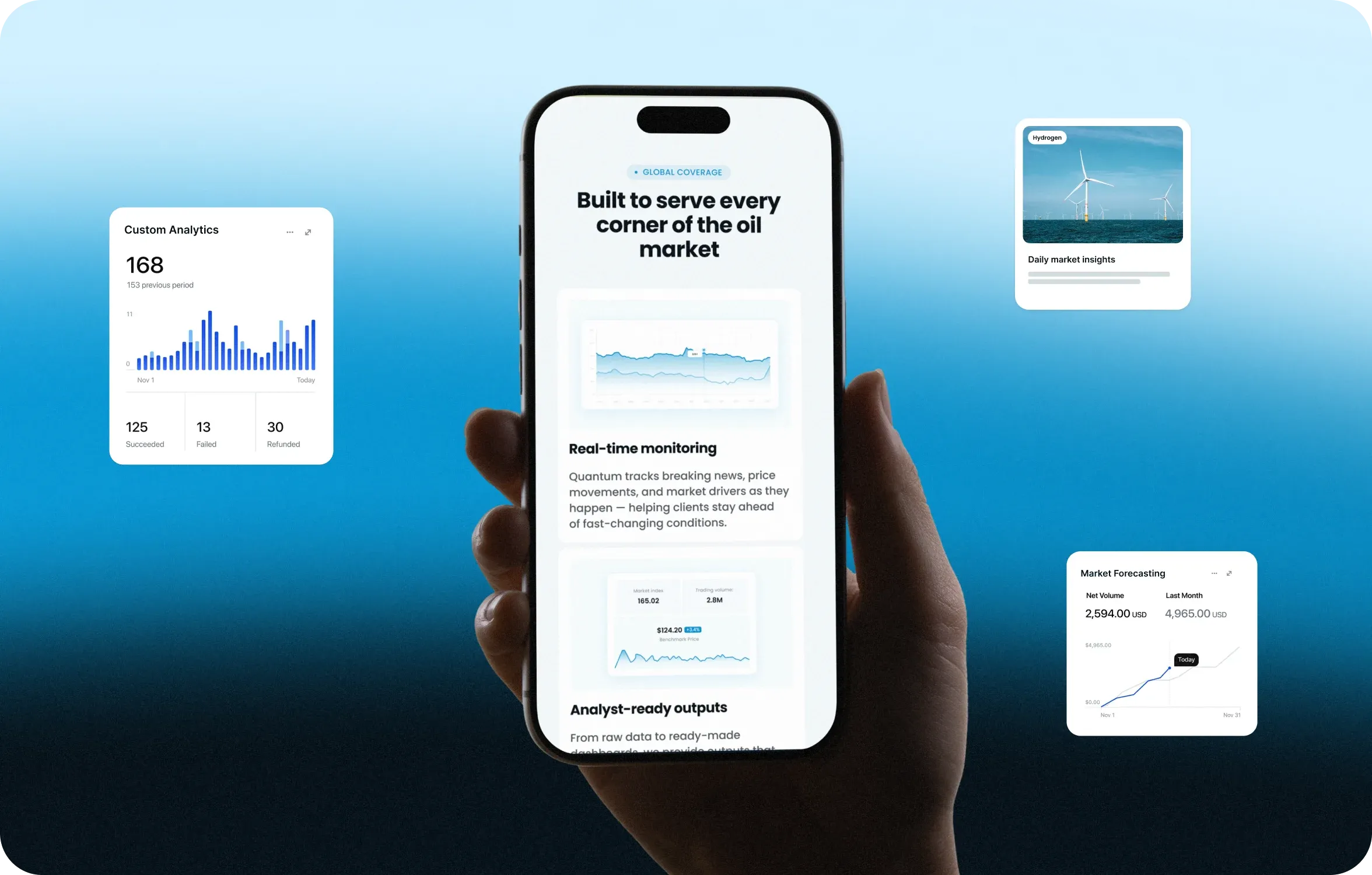
We then built the home page as a system of self-contained widgets: selected prices, subscription news, triggered alerts, policy updates, and an event calendar. The same structure could adapt to different user personas without splitting the product into separate experiences.


Alerts & urgency cues
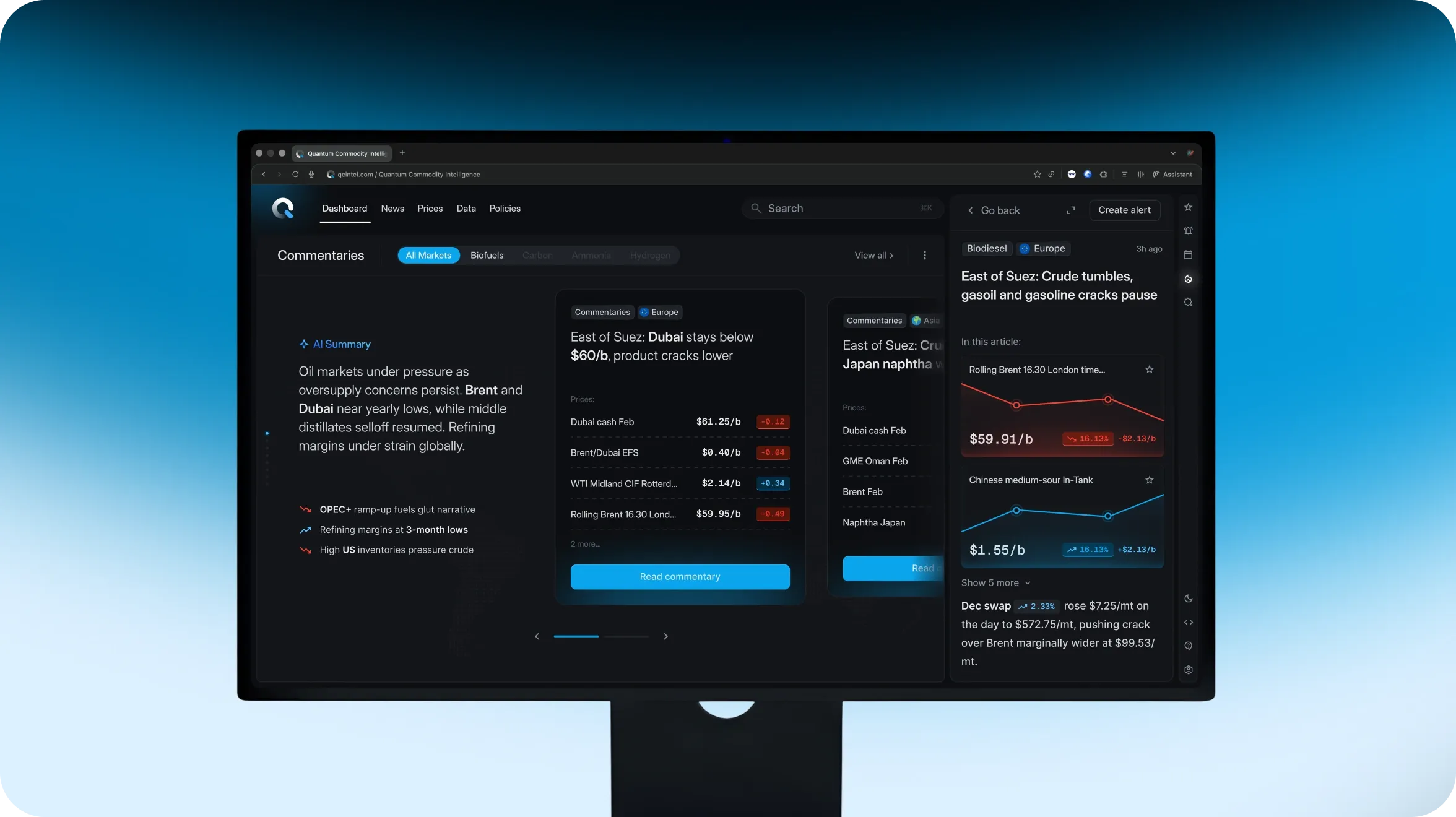
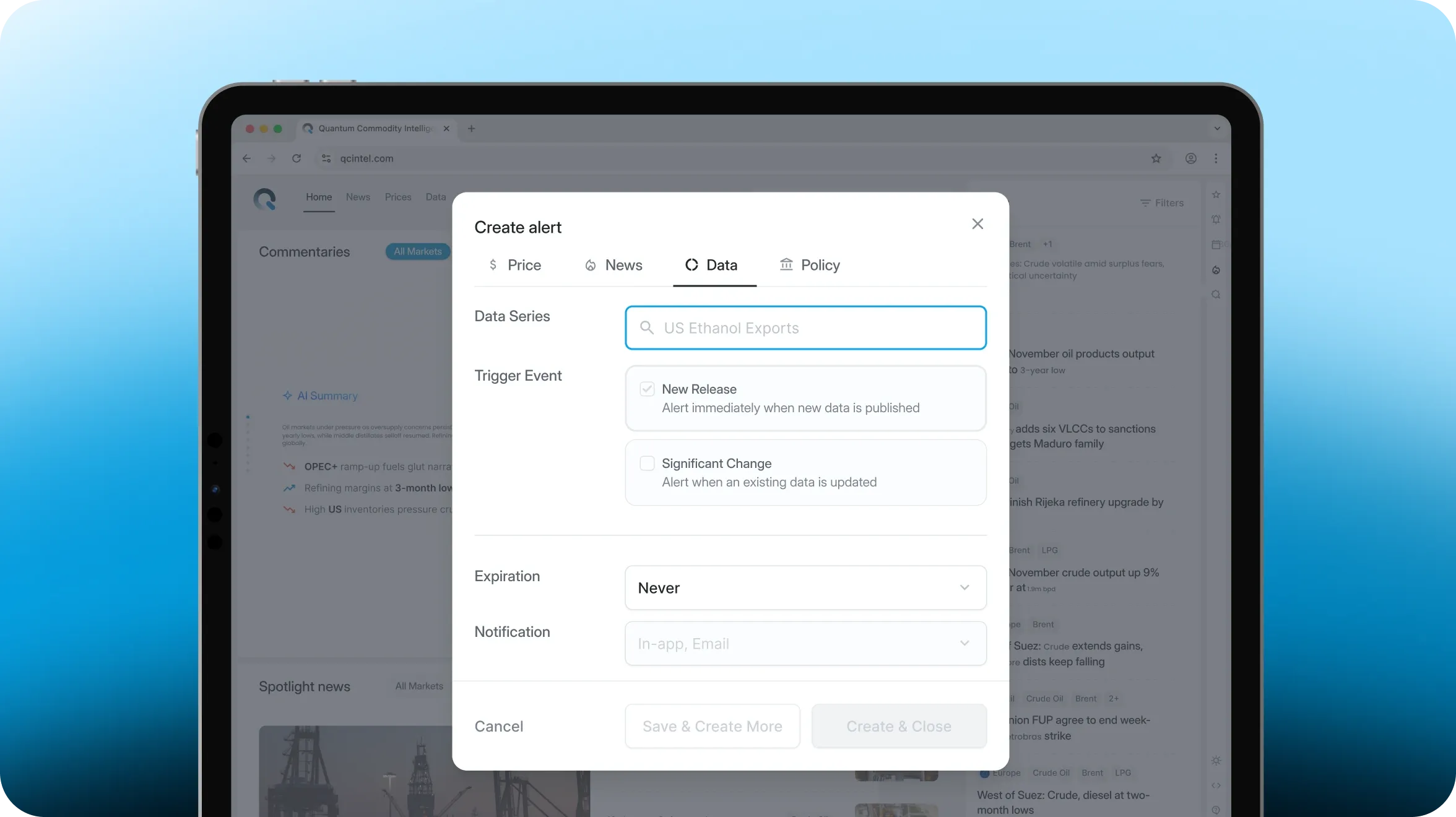
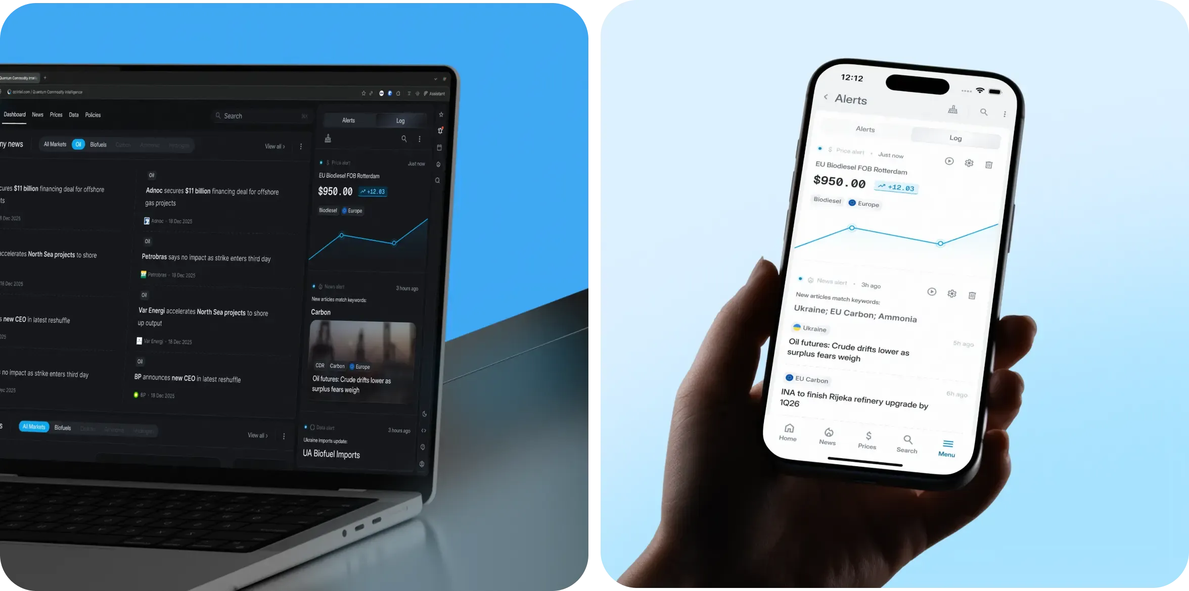
Alerts became the primary trigger for daily visits to the platform. We built a complete alert architecture across four content types: Price, News, Data, and Policies.
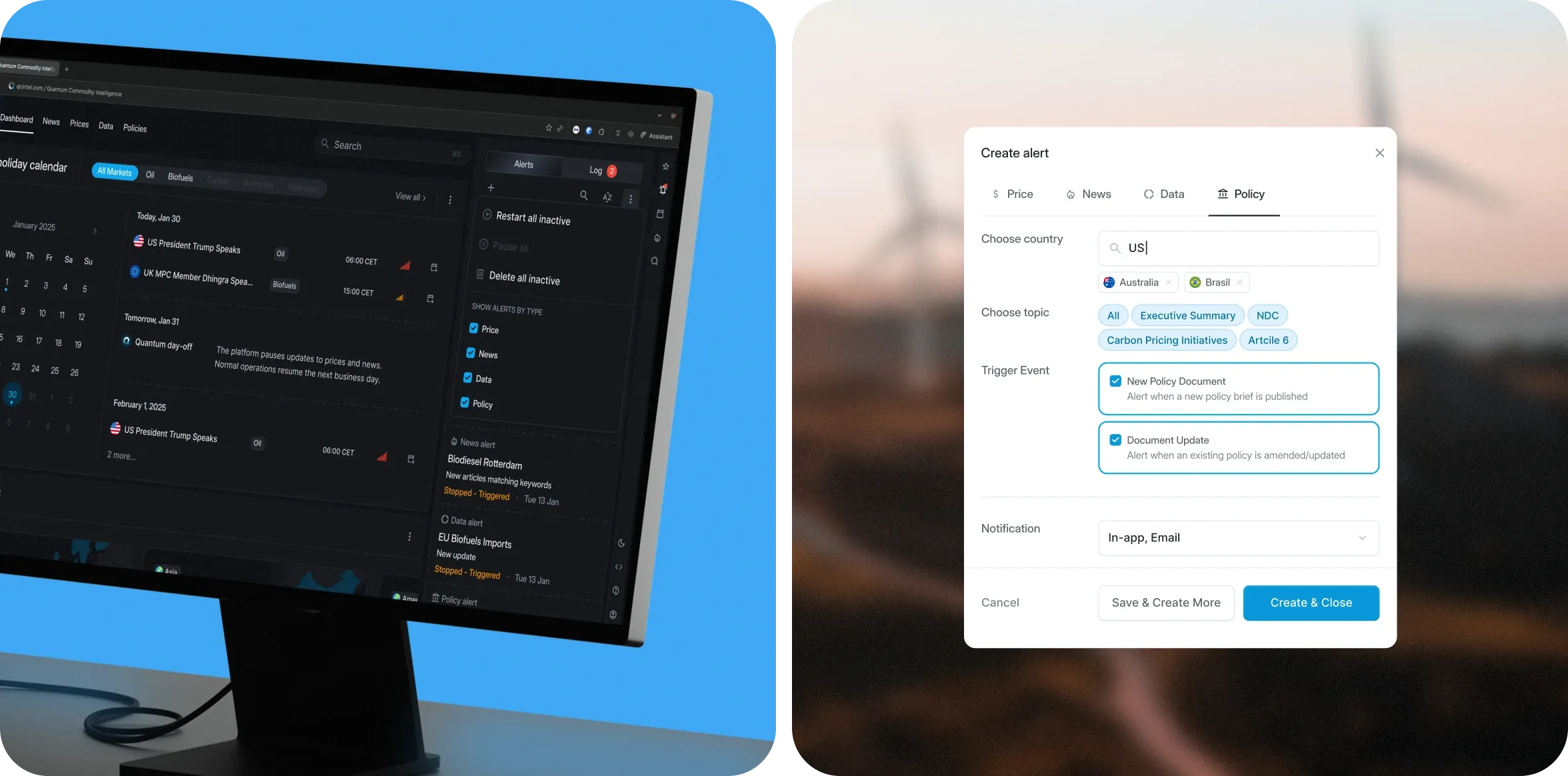
The key principle was simple: users can create an alert from anywhere on the platform without leaving the context of the task they are working on. Urgency cues for trial users, including an access countdown timer, and triggered notifications for significant price movements reinforced the platform’s role as a daily tool.

Right sidebar
It was a deliberate UX decision, bringing together secondary tools—watchlist, alerts, event calendar, and AI assistant—in a persistent component that stays visible across the platform.
A trader can switch to another task from any point in the platform without losing the context of their current work.
3-level navigation & progressive disclosure
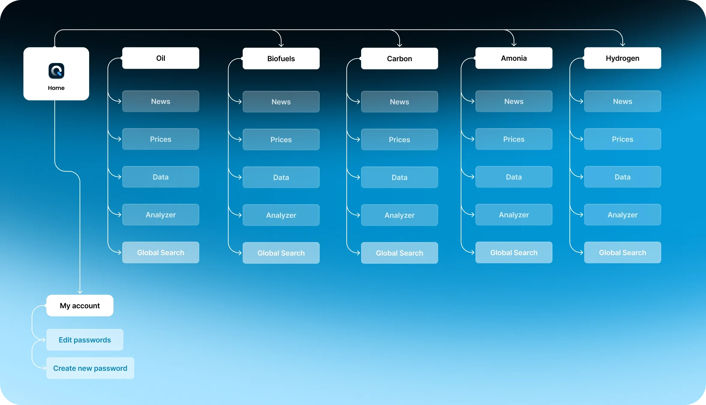
One of the more complex UX challenges was designing a 3-level navigation system for commodities. The previous platform used a simple dropdown that placed all categories in a single menu.
The new product needed a clearer way to sort and navigate across multiple markets without overwhelming users who were already familiar with the old structure.
We reworked the navigation hierarchy, grouping logic, and visual hierarchy around how traders move between commodities and content types. The goal was to make the new structure easy to pick up while keeping familiar paths for experienced users.
Architectural solution:
- Primary commodity types—Oil, Biofuels, Carbon, Ammonia, and Hydrogen—sit at the first level and use large type that also serves as the page heading.
- Secondary filters such as News Type, Date, and Location sit in separate controls, keeping them out of the primary navigation.
- Selecting a commodity opens an optional menu with badge-style subcategories. This follows the progressive disclosure principle: users see additional detail when they need it, rather than facing the full category structure at once.
Price matrix
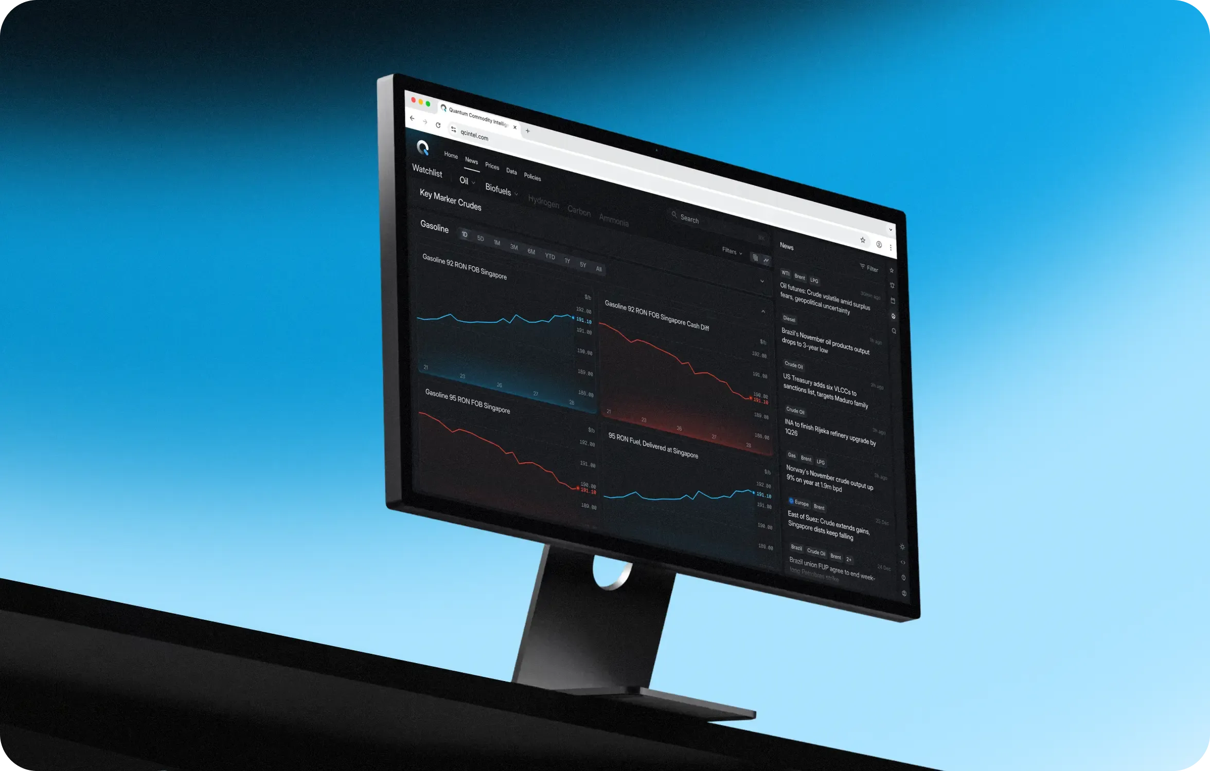
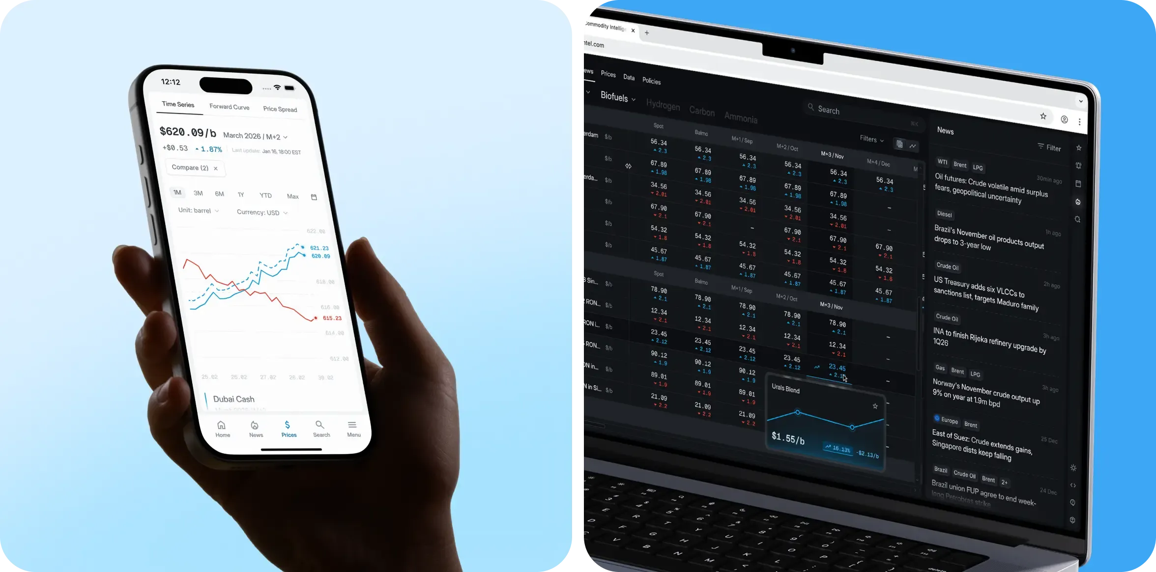
The client wanted to rethink the price table from the ground up, using competitor solutions as a reference point. But their UX did not fit Quantum’s use case, so we paused the design work and spent an additional week on UX research to find a better approach.
The key decision was to open individual prices in a drawer rather than on a separate page. Traders work with a complex table and process multiple positions at once. Opening a new page for every price would break their context and force them to navigate back to the same place. The drawer keeps the table in view, letting users inspect price details and return directly to the same row.
We also reworked the table structure to make large volumes of data easier to organize and navigate.
Information density
The client wanted a high-density interface similar to Bloomberg or Refinitiv. But that level of density serves a specific purpose in trading terminals: traders need to monitor and act on large volumes of data at once.
Quantum serves a different purpose. Its primary job is to make market content easy to find and consume. We chose a middle ground between a newspaper and a trading terminal: keeping information density high while giving users a clear path to the content they need.
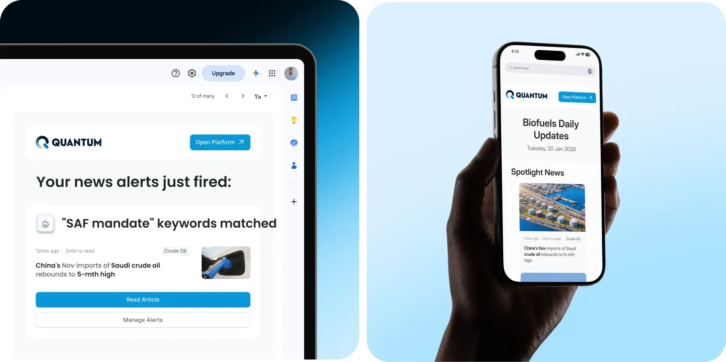
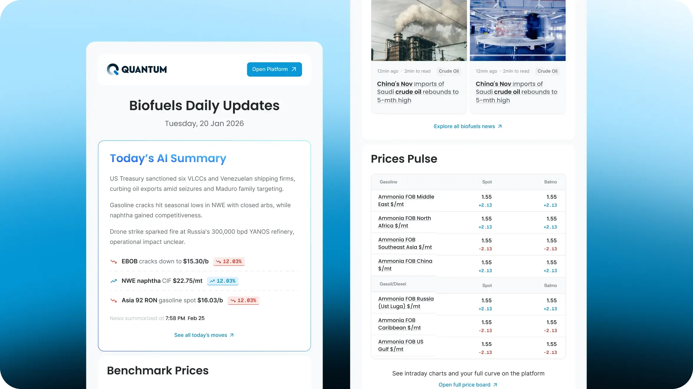
Email newsletter
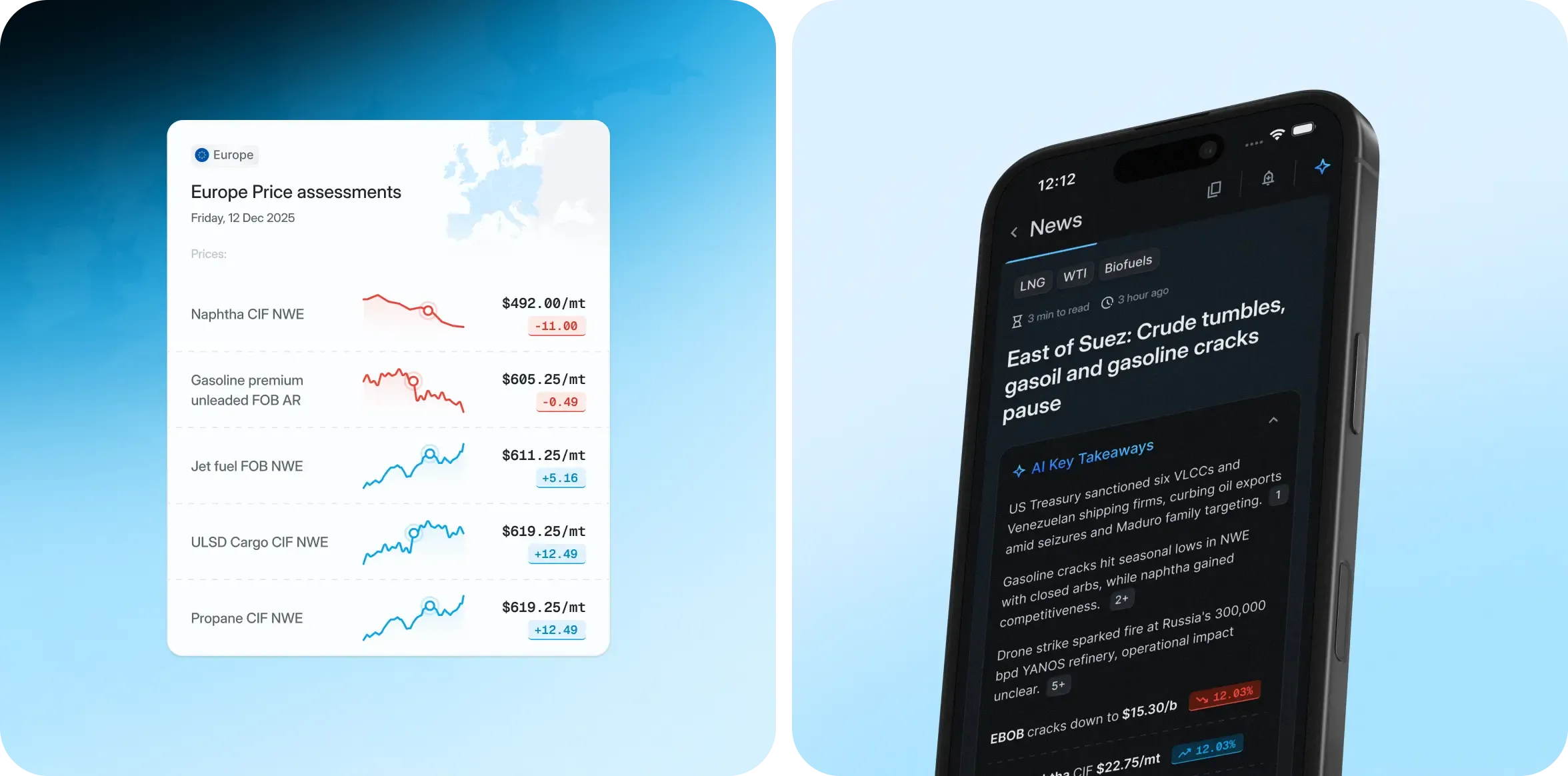
We rethought the email newsletter as part of the product journey rather than a standalone product. The new design gives users a clear reason to return to the platform—compare prices, set up an alert, or explore the full chart. Email starts the journey. The platform takes it further.
Project outcomes
Product achievements
- A unified Design System supporting Light and Dark Modes, built for future product expansion
- A personalized home page adapted to different user personas
- A complete alerts architecture across Price, News, Data, and Policies, giving users a reason to return to the platform daily
- A redesigned Price Matrix with drawer navigation, allowing users to work with large volumes of data without losing context
- Functional AI prototypes that allowed the team to test complex flows before handing them over to development
UX & strategic results
- A new navigation system that adapts to each user’s subscription while also creating opportunities for cross-sell
- The redesigned email experience is now part of the engagement loop: instead of competing with the platform, it brings users back to it
Expected business deliverables
- The redesigned platform now has the tools to convert 80% of “email-only” clients into regular platform users
- Onboarding collects profile data such as role and company, giving the sales team more context for pricing conversations
- Simplified API discovery makes it easier for clients to set up their own data feed without involving sales
- The platform’s premium look supports higher subscription pricing for new clients and strengthens the company’s position in negotiations with potential business partners
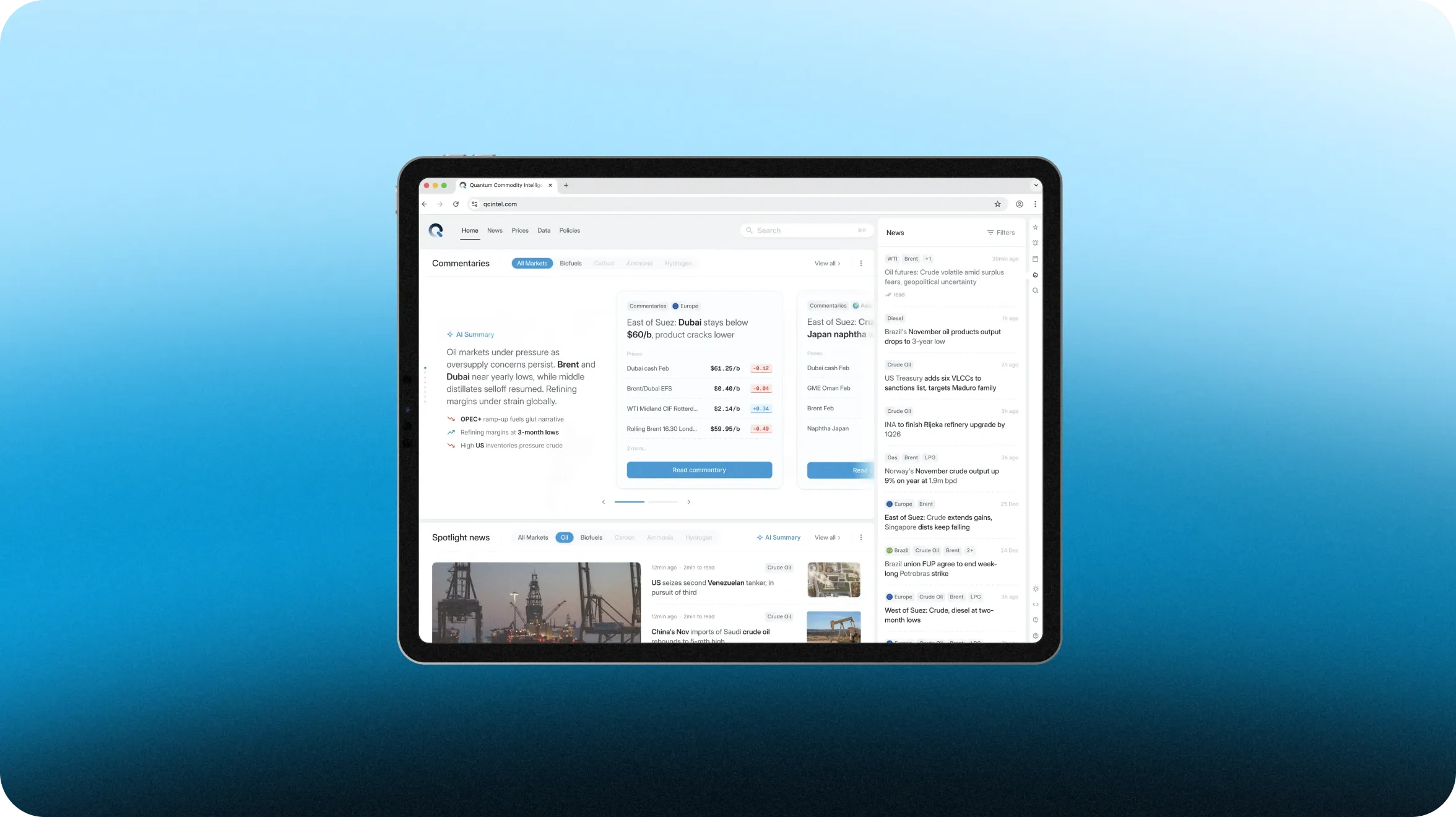
Marketing website design
The starting point
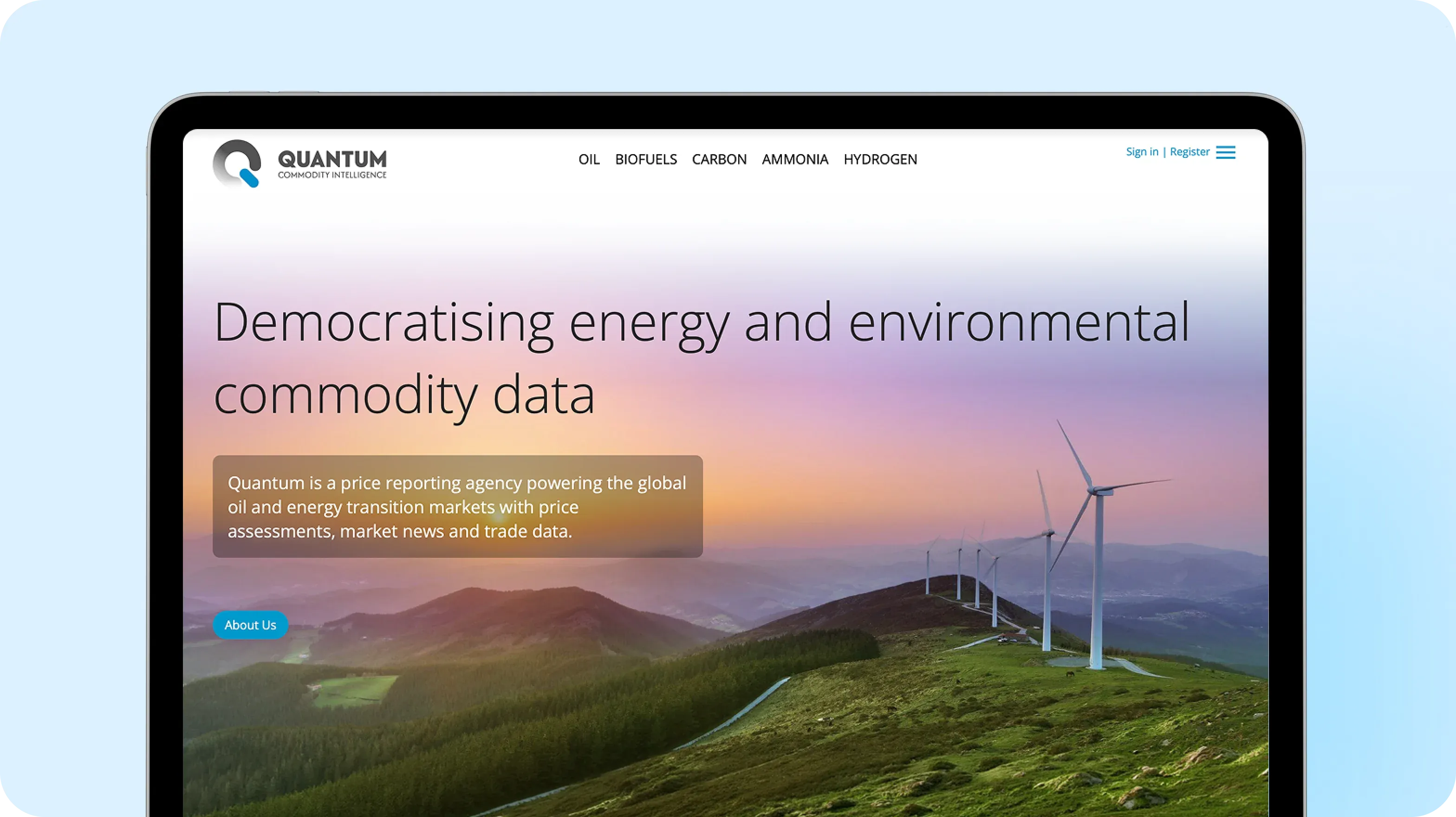
When the client approached us, the website was already live, but it had the same outdated feel as the platform: heavy, cluttered, and lacking a clear marketing logic. Its first impression didn’t match the product’s quality.
Despite the company’s strong expertise, the website made Quantum look weaker than its competitors, did little to build trust, and struggled to attract new users.
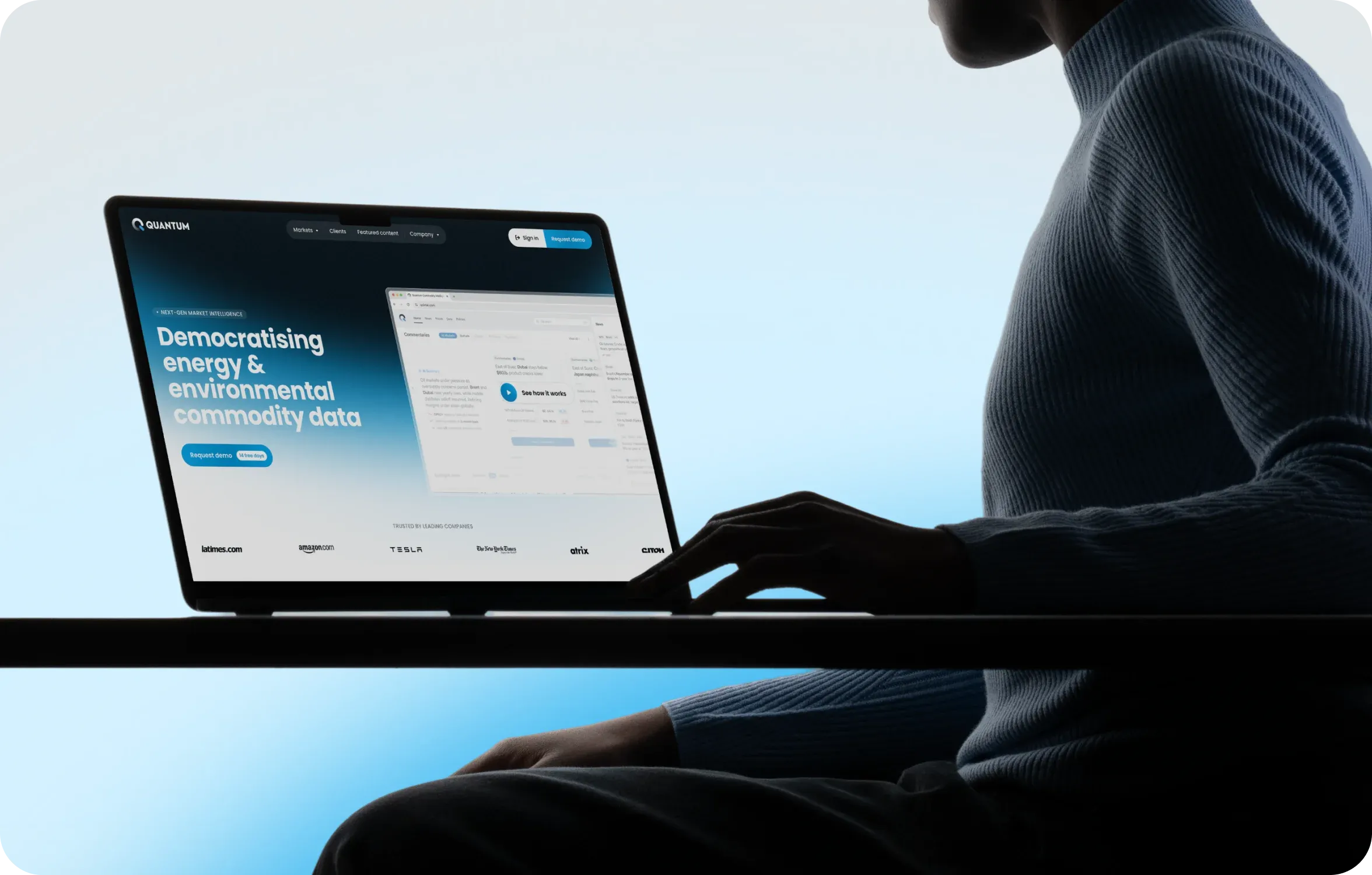
Key challenges with the previous corporate website
- Outdated visual concept — the site didn’t convey the depth of Quantum’s market analysis, lacked a unified design system, and had no consistent visual language.
- No clear marketing purpose — it was unclear what Quantum offered, who it was for, or why a potential client should try it.
- Weak calls to action and conversion paths — the site gave visitors few clear next steps toward trial access or a demo.
- The site and platform looked too similar — there was no clear distinction between the marketing-facing website and the product people used for their daily work.
- No defined brand guidelines — the lack of clear rules made it difficult to maintain a consistent visual language as the website and product evolved.
Website project goals
The website was designed to become the first point of contact between a potential client and the product, with every element working toward two things: attracting new users and making Quantum’s value clear. Specific objectives were the following:
- Generate leads — drive registrations for trial access and demo requests
- Build the brand — clearly communicate who Quantum is, what it offers, and why potential clients can trust it
- Attract partners — create opportunities for new partnerships in the market
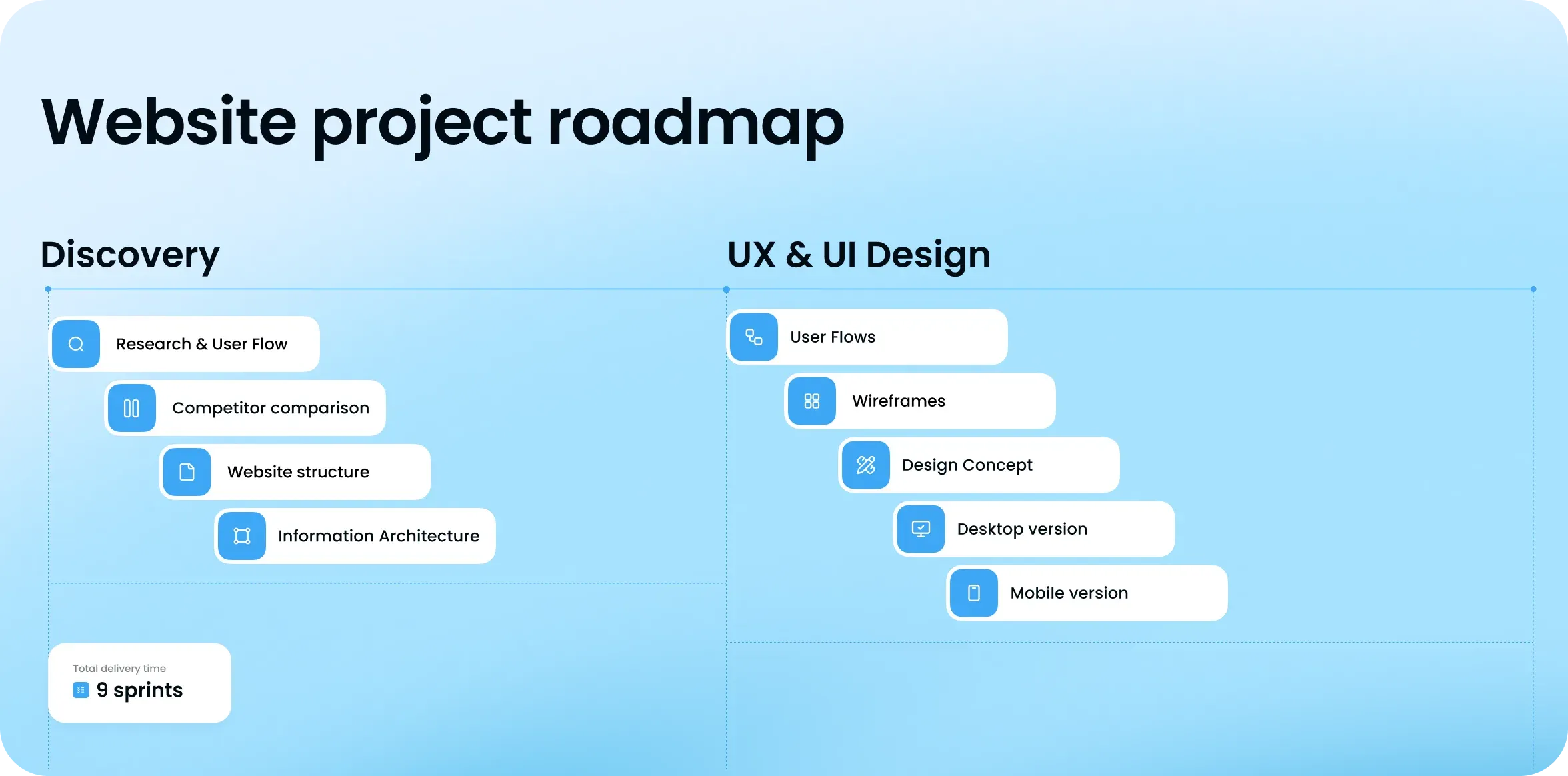
Our approach
Website discovery phase
The website is a marketing tool. That’s why we started with understanding the customer journey rather than visual design: what potential clients need to see, how they evaluate solutions, and why they should choose Quantum over strong competitors.
- Website and platform audit — assessed the existing experience and identified the key problems to address
- Competitor analysis — reviewed top competitors and references from adjacent markets
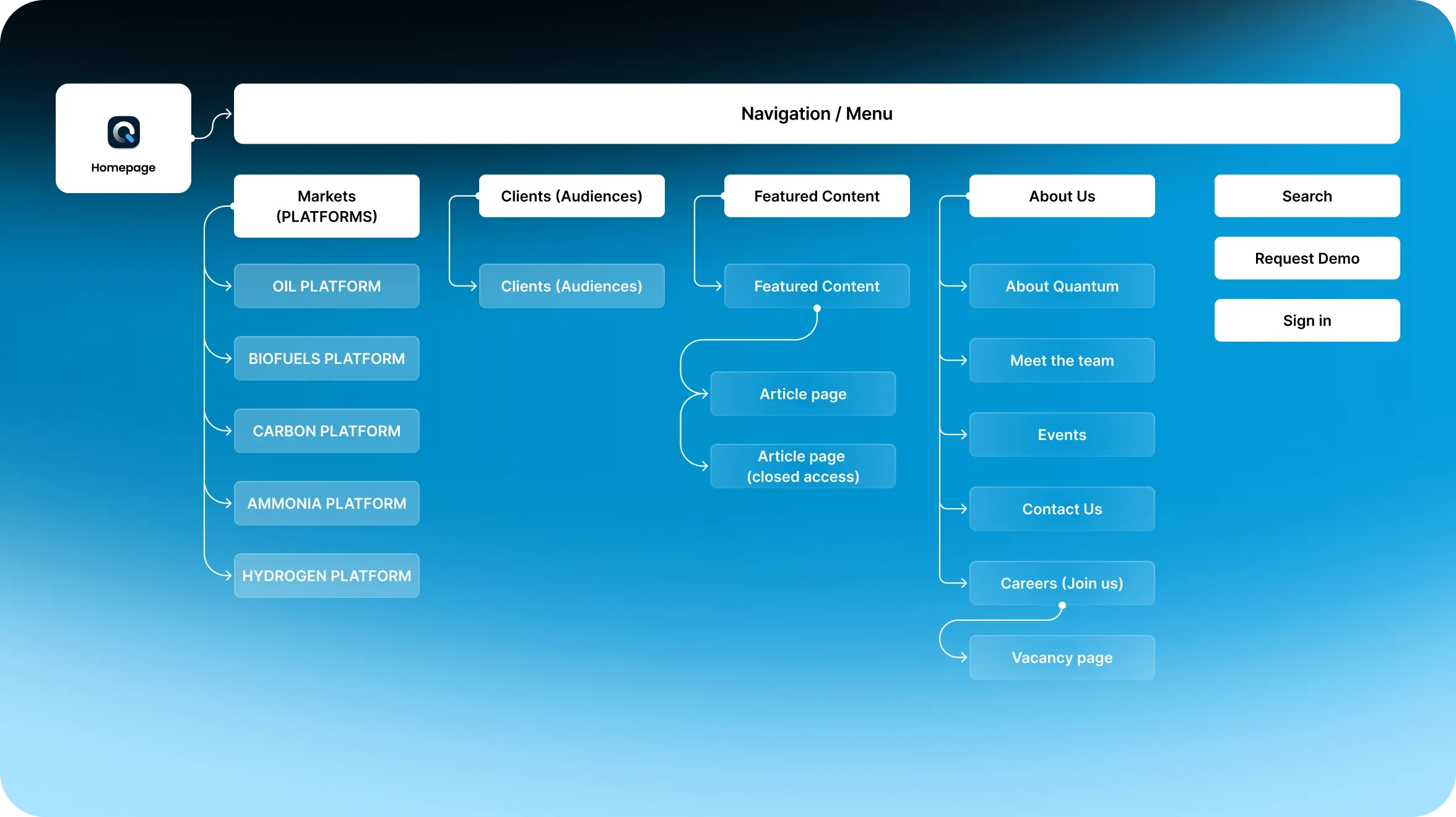
- Sitemap and information architecture — structured the site around how potential clients evaluate and choose a solution
- User flows — mapped the key paths from first contact with the site to registration
- Wireframes — tested the structure and page logic before moving into visual design
- Two design concepts — developed two distinct visual directions for comparison and discussion
UX/UI design phase
- Full website design based on the selected concept
- Base component set (UI Kit) to ensure visual consistency across the site
- Custom illustrations and video animations for key sections
- Mobile adaptation of all pages
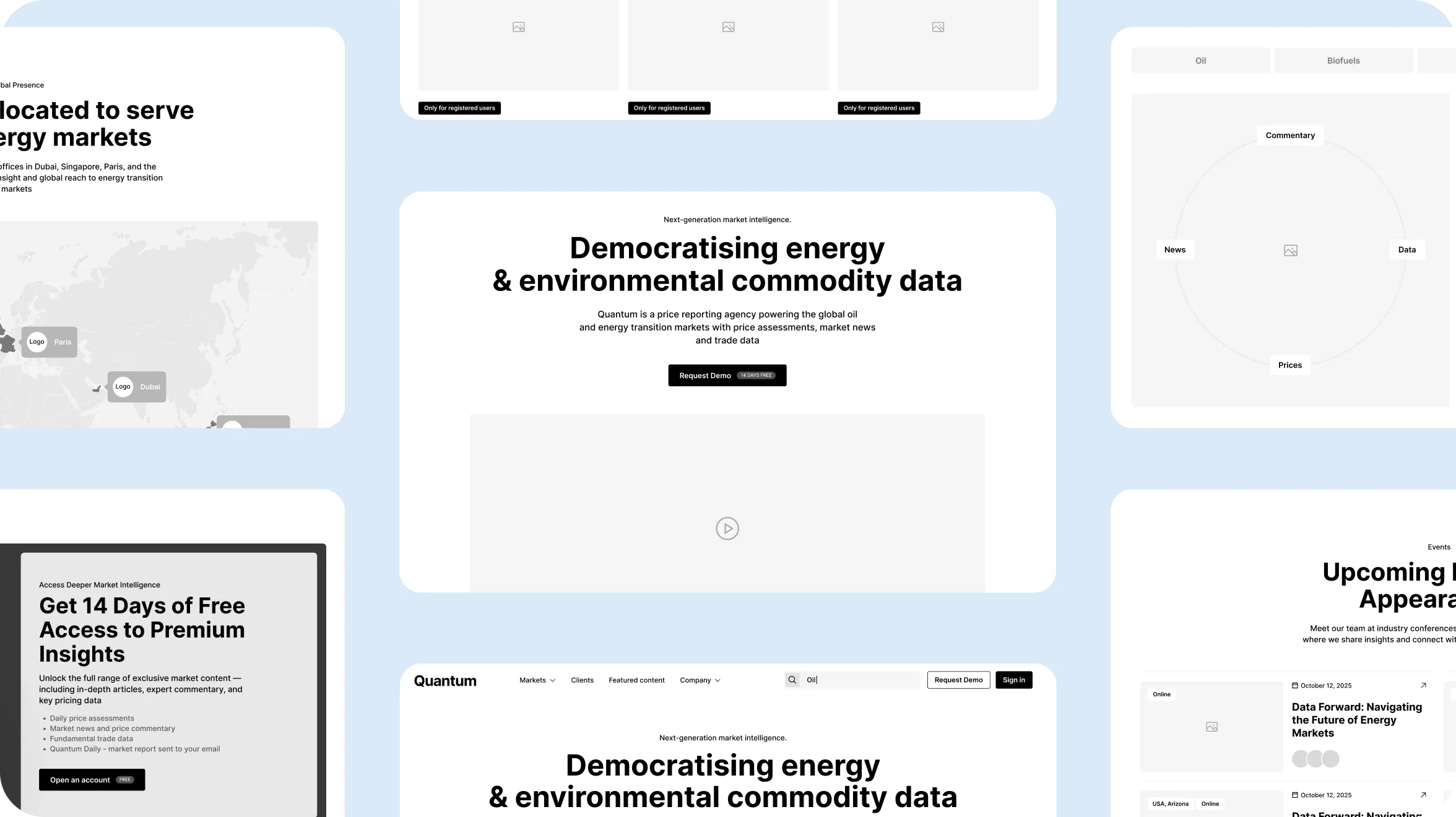
Key design decisions
The site and platform are intentionally different
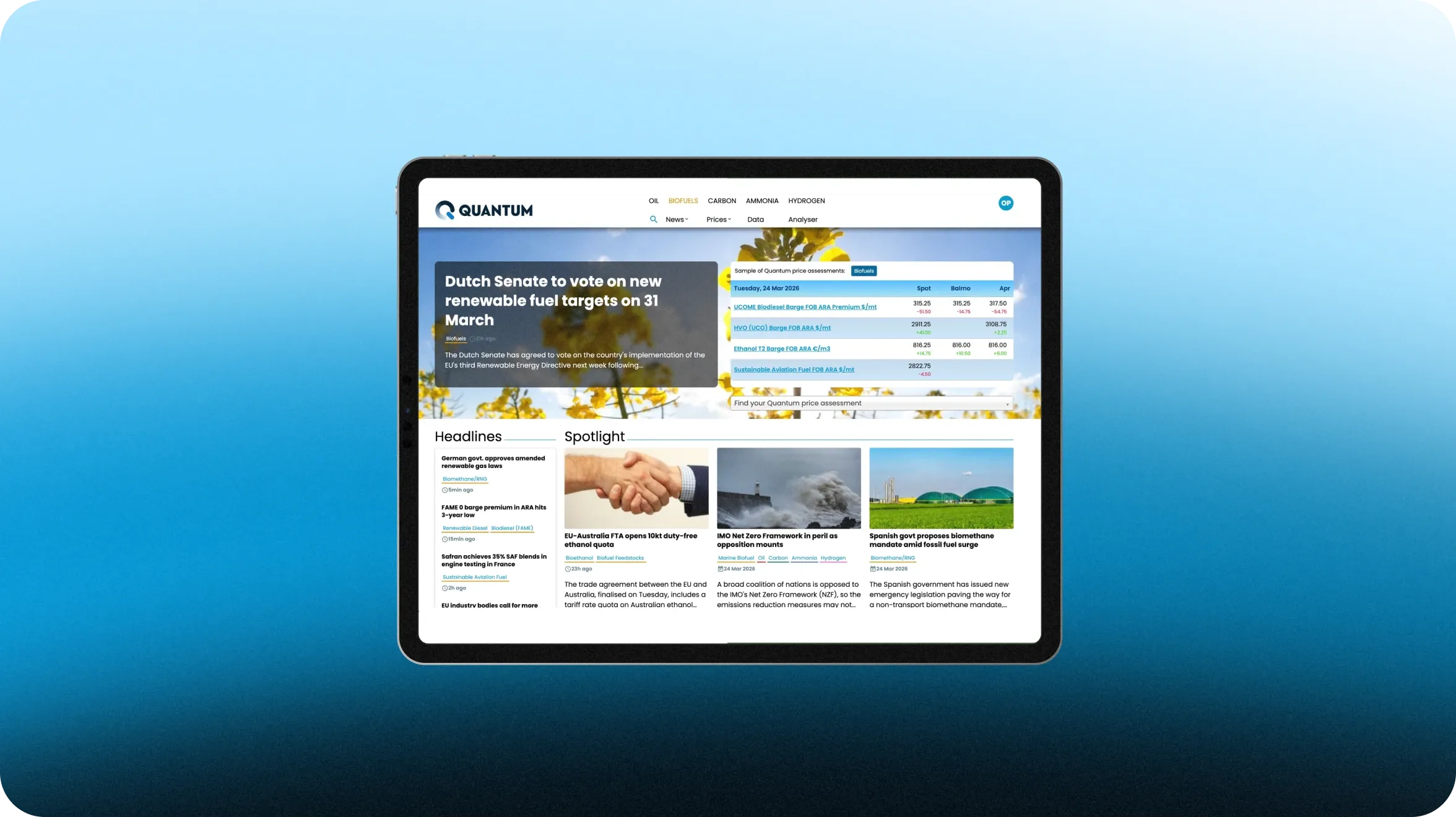
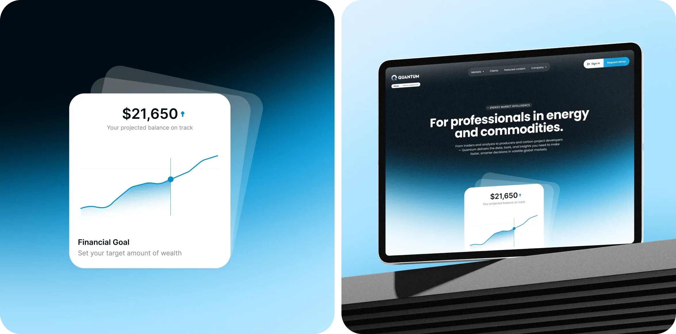
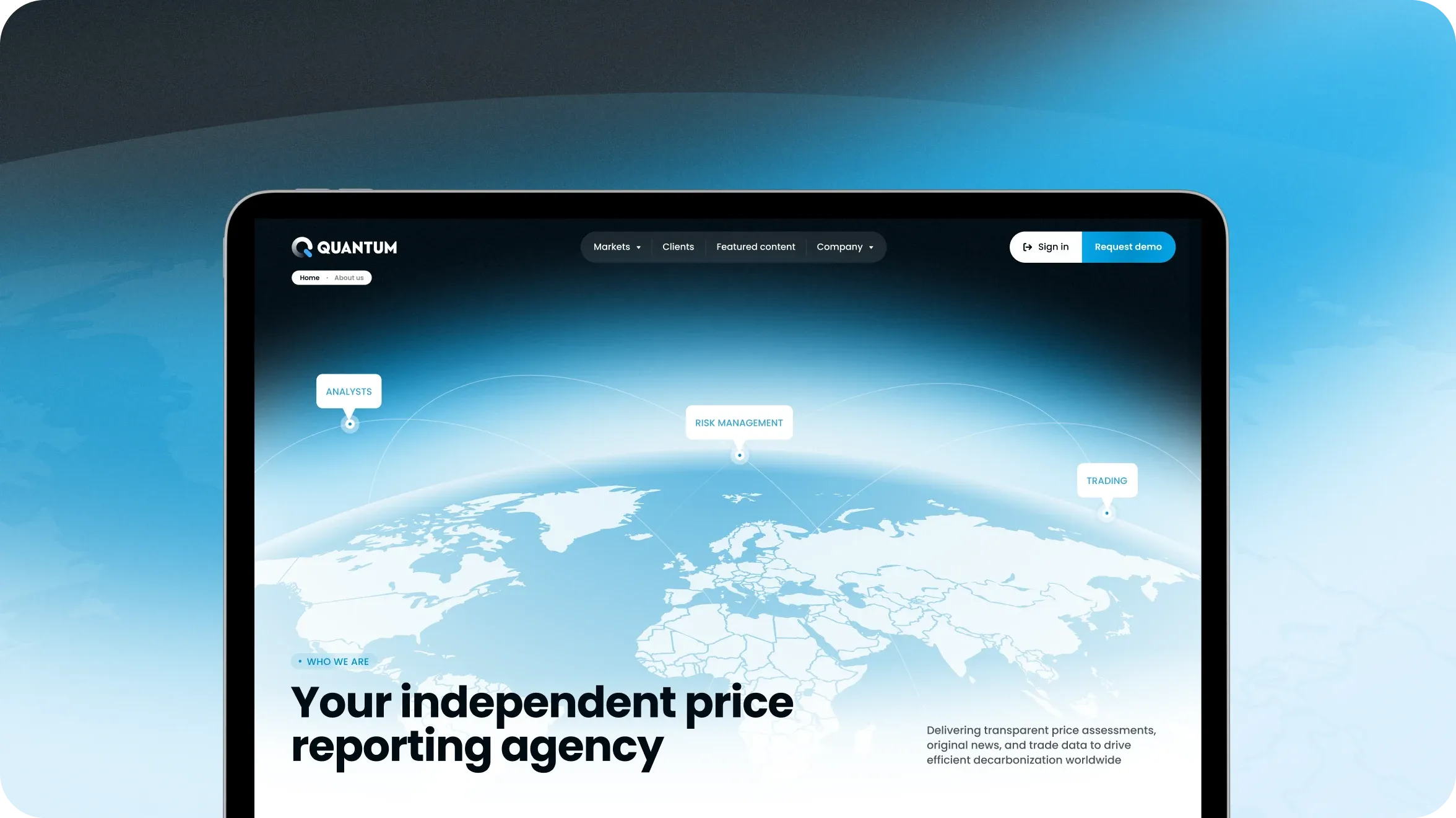
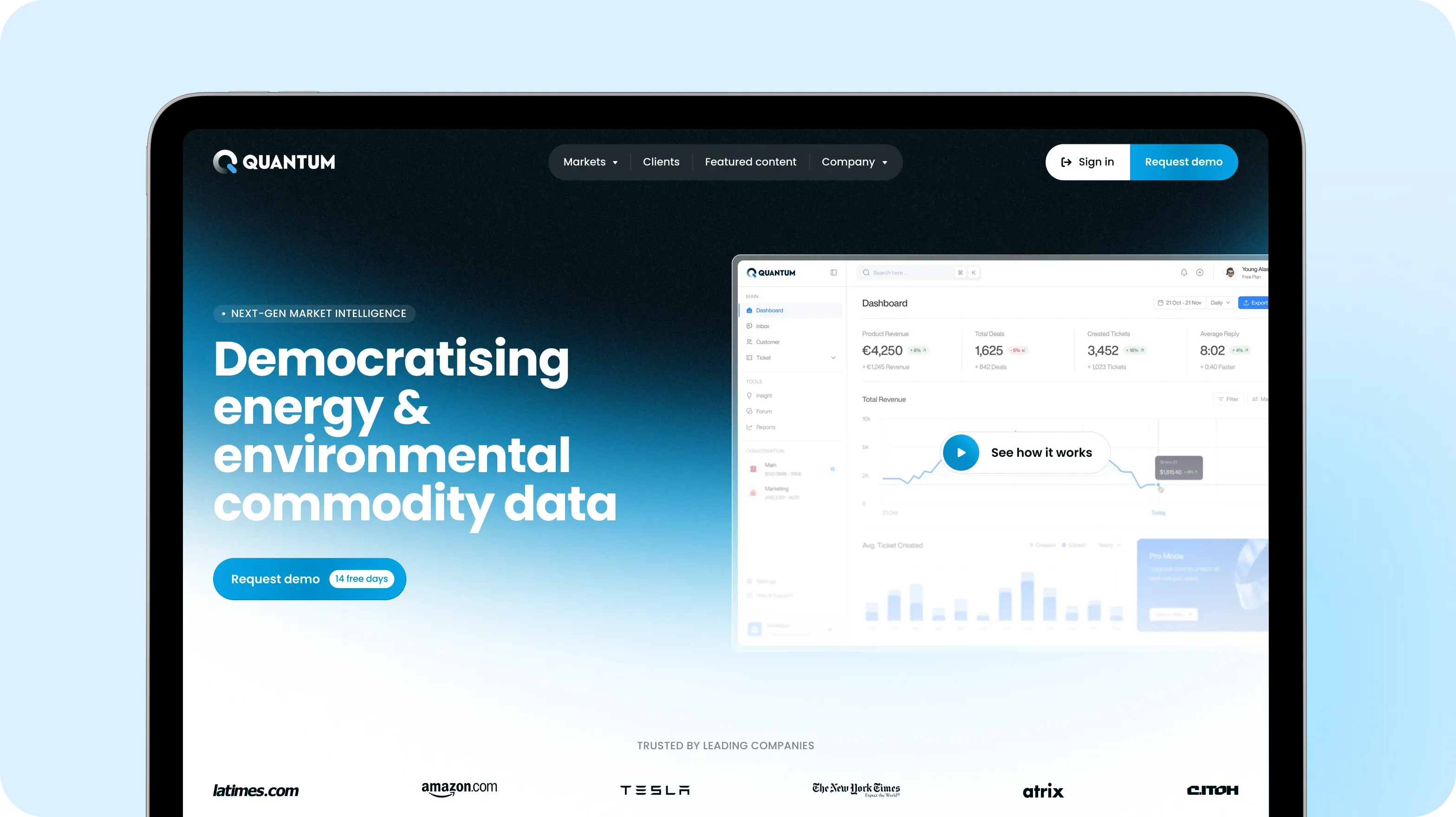
This was a deliberate design decision, not a discrepancy. The site and platform serve different purposes: the website needs to capture attention and make a strong first impression, while the platform needs to work as a daily tool for handling large volumes of information.
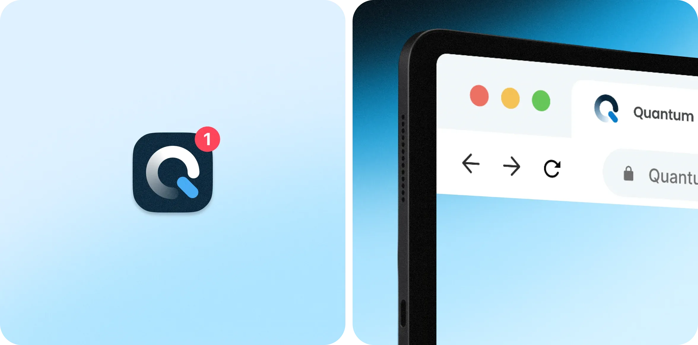
Quantum logo adaptation
The client didn’t have a complete brand identity in place; however, we didn’t build the identity from scratch. Instead, we adapted the existing logo to meet current design requirements, making it richer and more expressive.
We kept the symbol and typography largely unchanged to preserve the brand recognition Quantum had already established in the market.

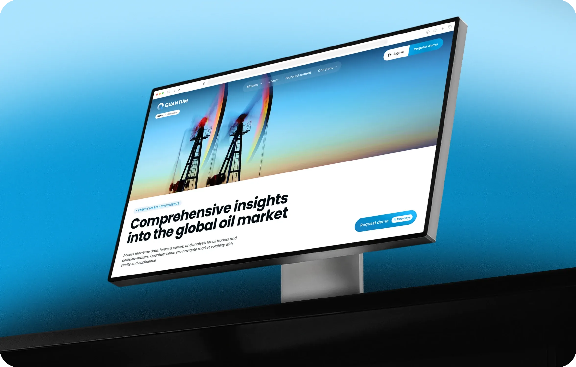
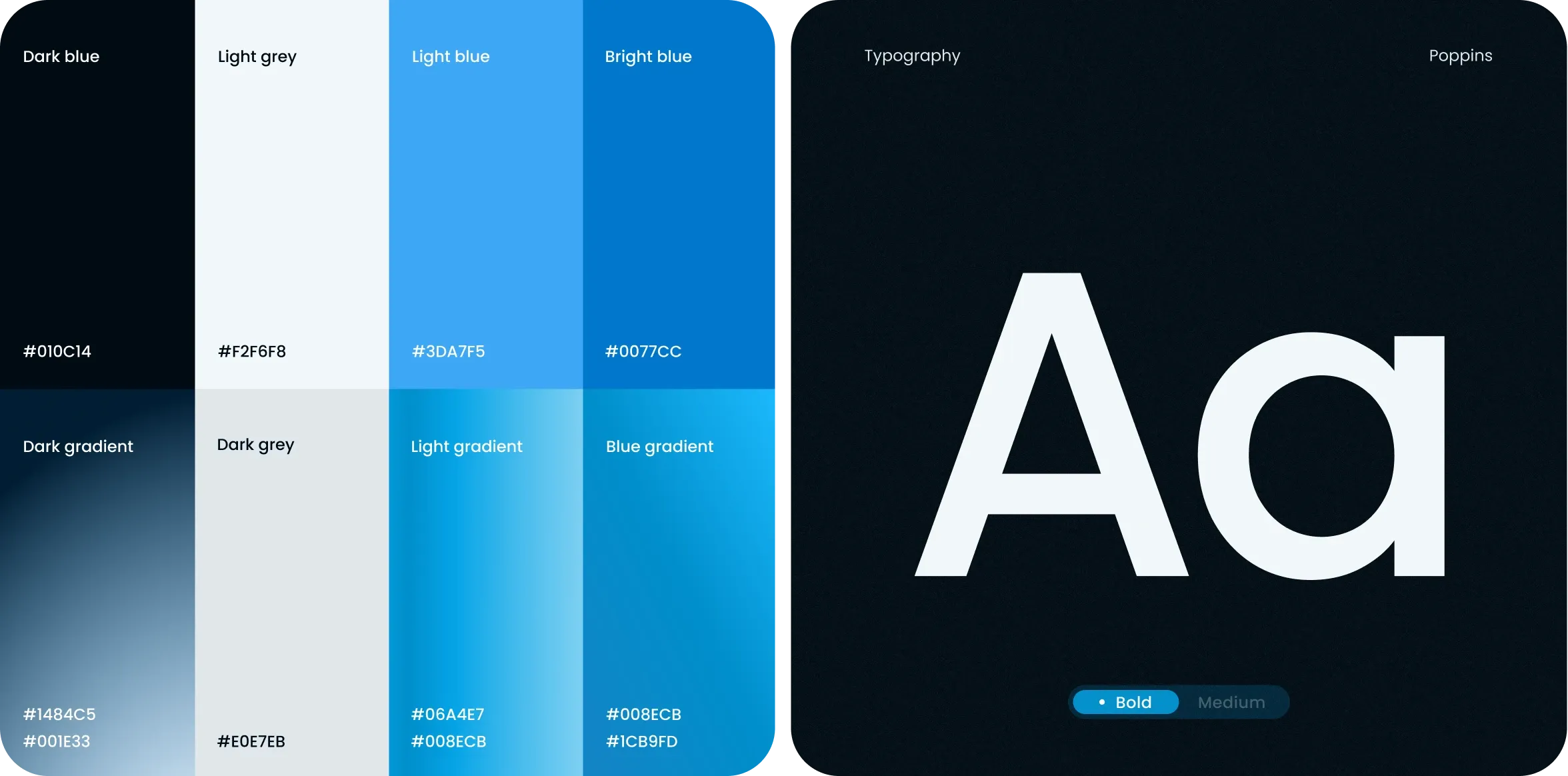
We used bold, large-format typography on the website because it works well across marketing pages and reinforces the brand’s confidence. On the platform, the same approach would reduce readability across dense price tables and news feeds. There, we chose more neutral, functional typefaces built for extended use.

Structure as a marketing tool
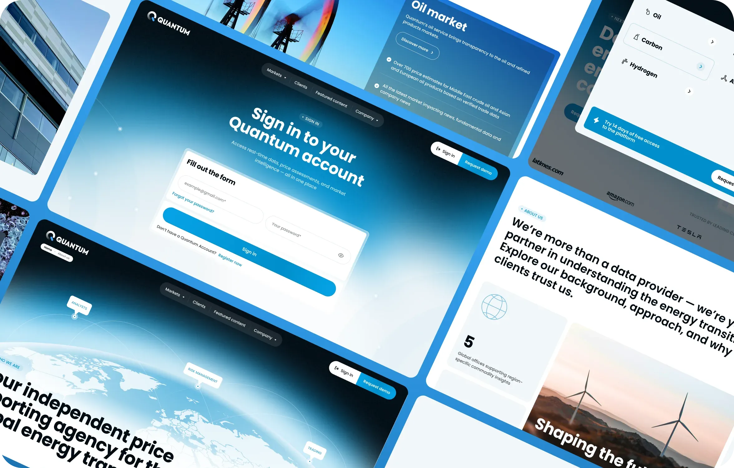
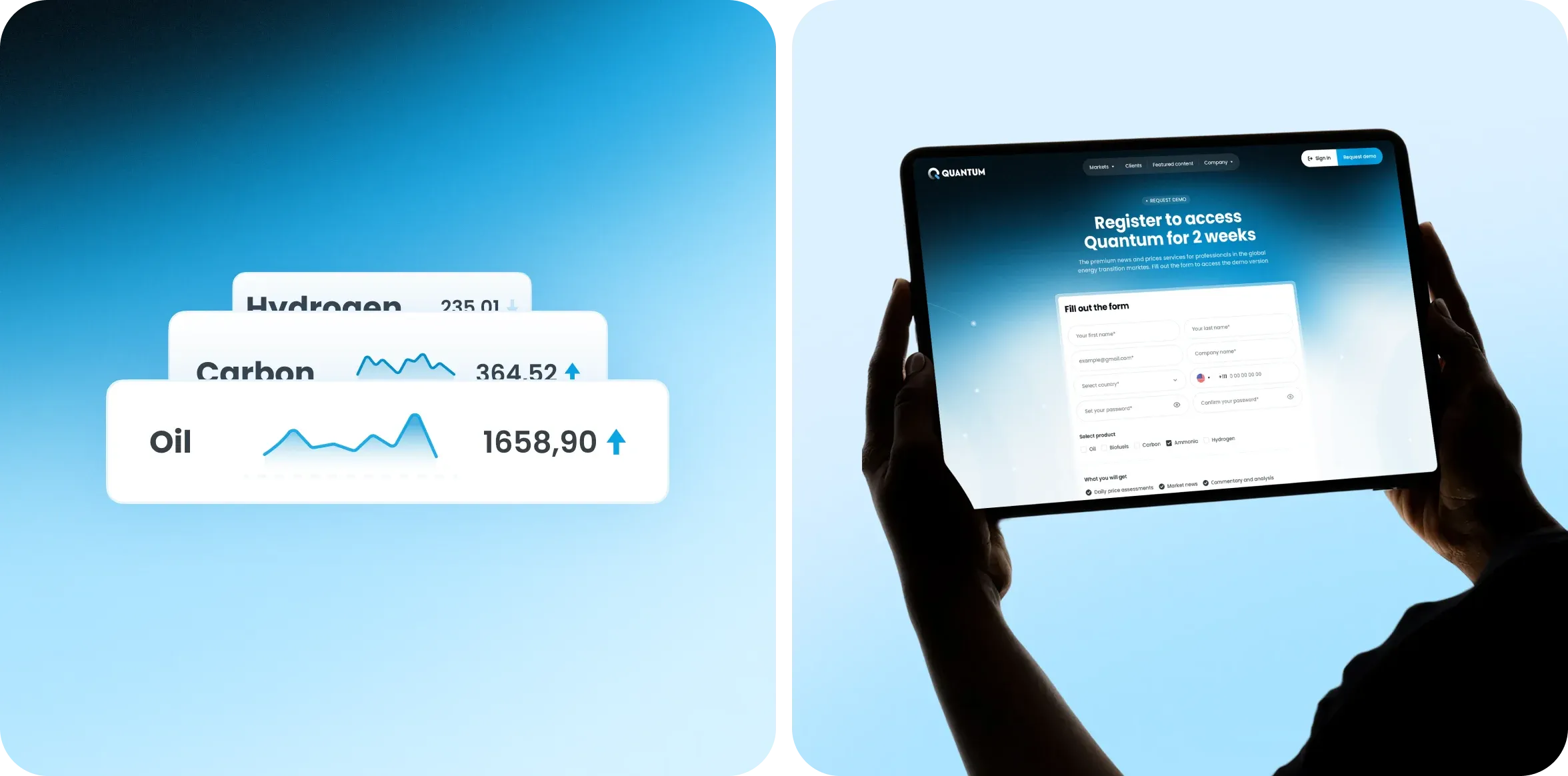
We built the site architecture around a single goal: move visitors toward registration as quickly and naturally as possible. Every page plays a role in that journey.
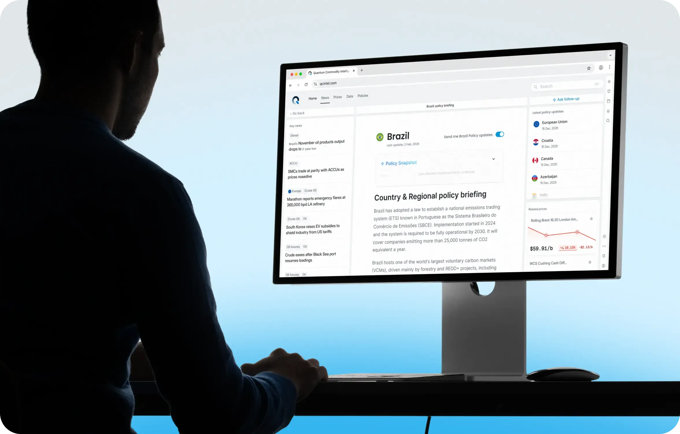
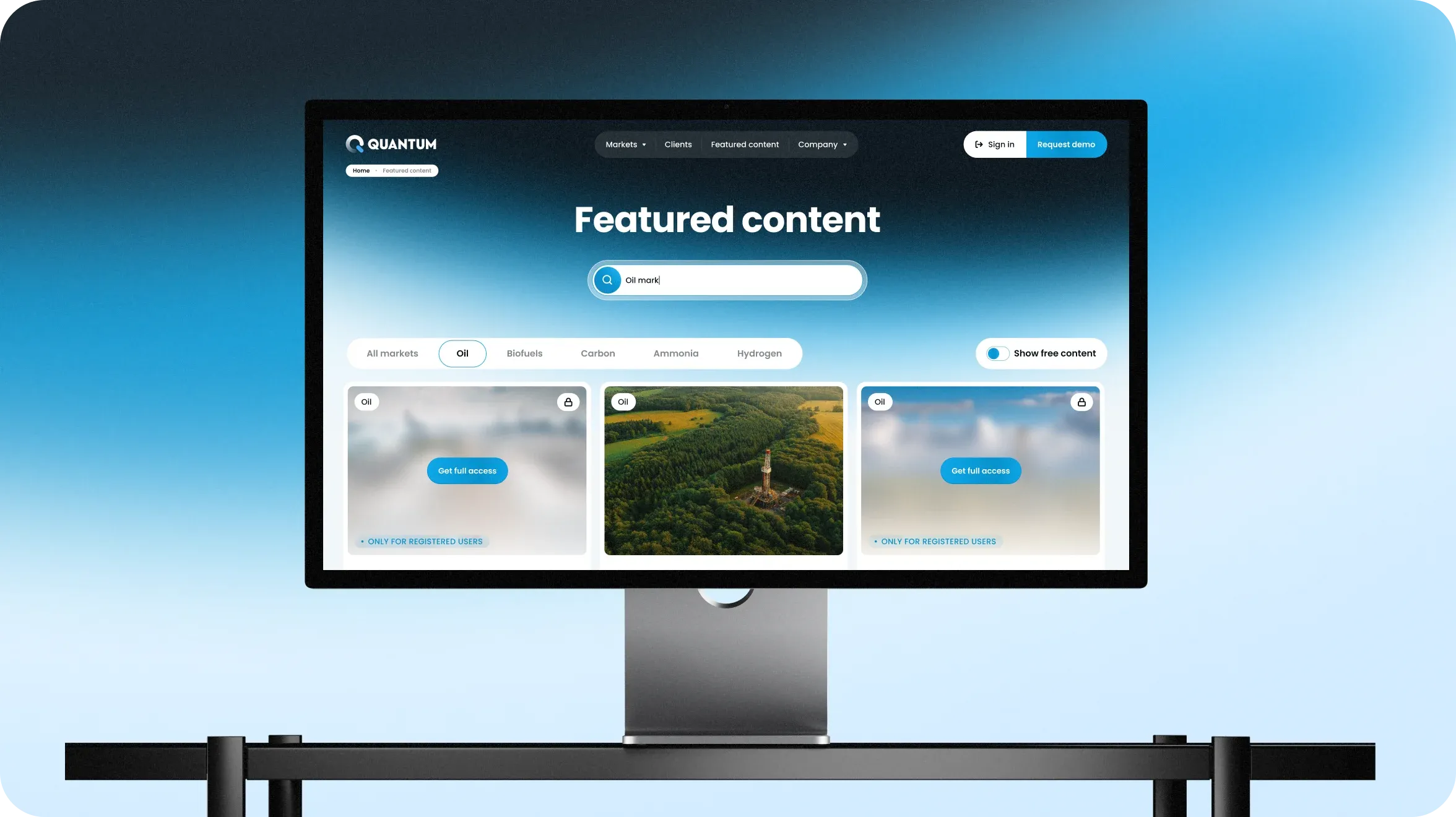
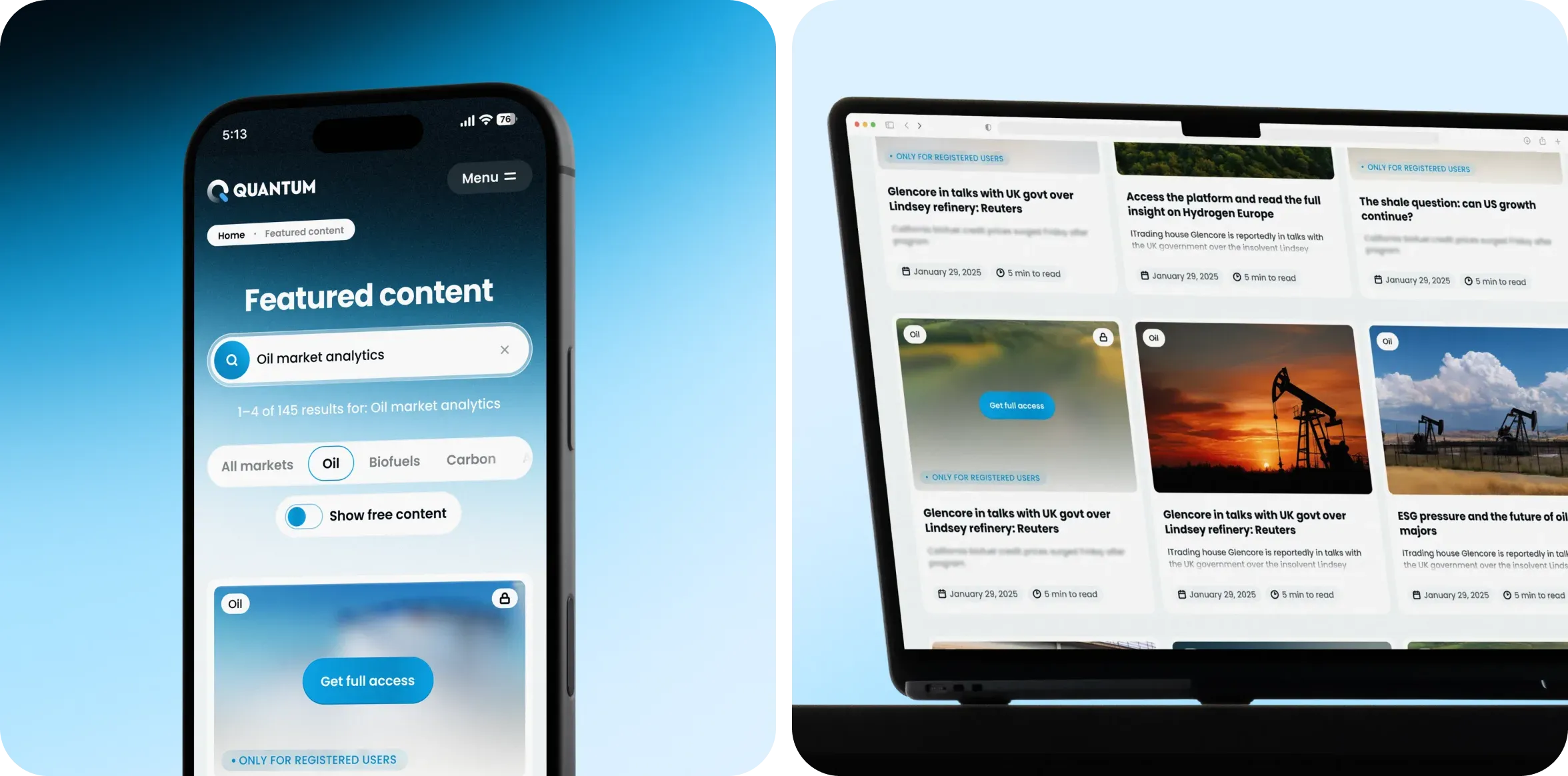
Registration is the primary action. New visitors can read a few articles for free, then see that the rest of the content requires registration. This creates a natural path from exploring the content to signing up for access.
Project outcomes
Scope of work delivered
- ~18 fully designed pages
- ~150+ unique user interfaces
- UI kit, as the backbone for website development
- Custom illustrations created specifically for the project
- Mobile adaptation of all pages
Strategic results
- The website gained a clear marketing structure with a primary focus on registration and demo requests
- The company can now communicate its value more clearly to users and potential partners
- The adapted logo preserves existing brand recognition while giving it a more modern look
- The company gained a cohesive visual identity for the first time
Other projects
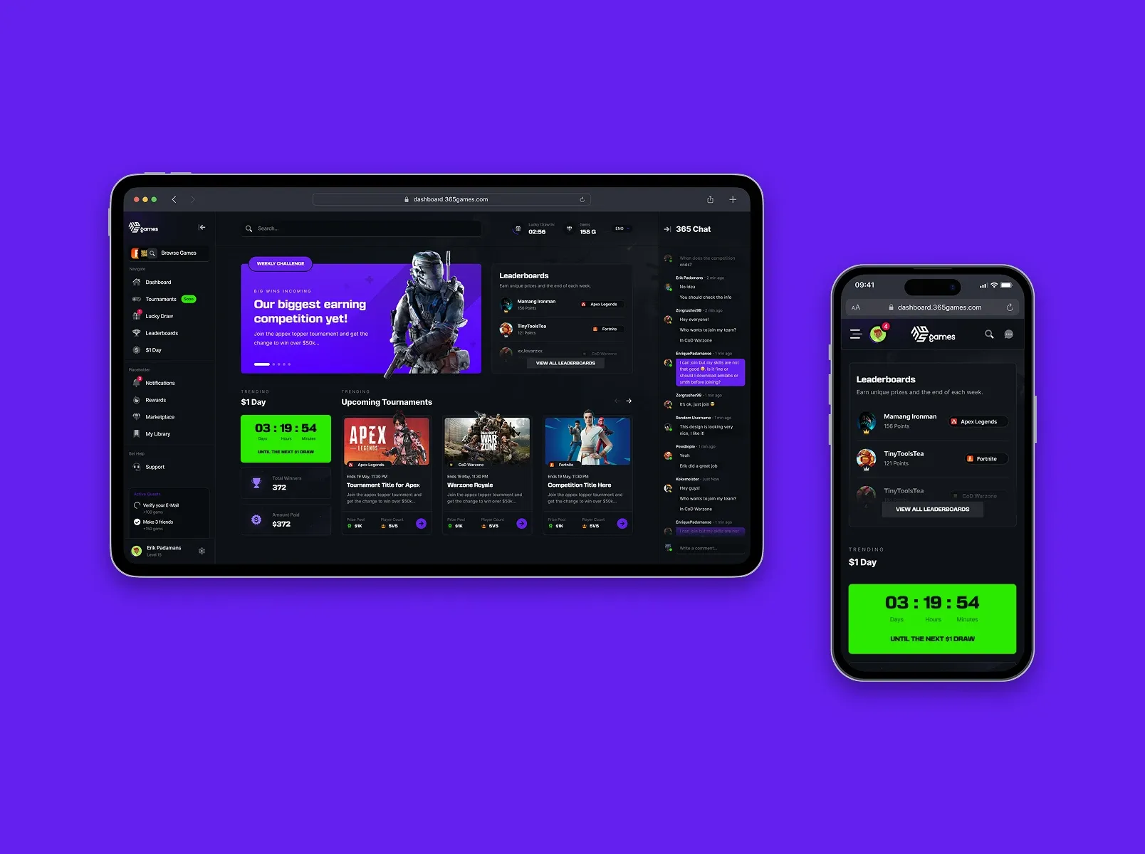
365games
eSports web app development and marketing website design for the gaming community


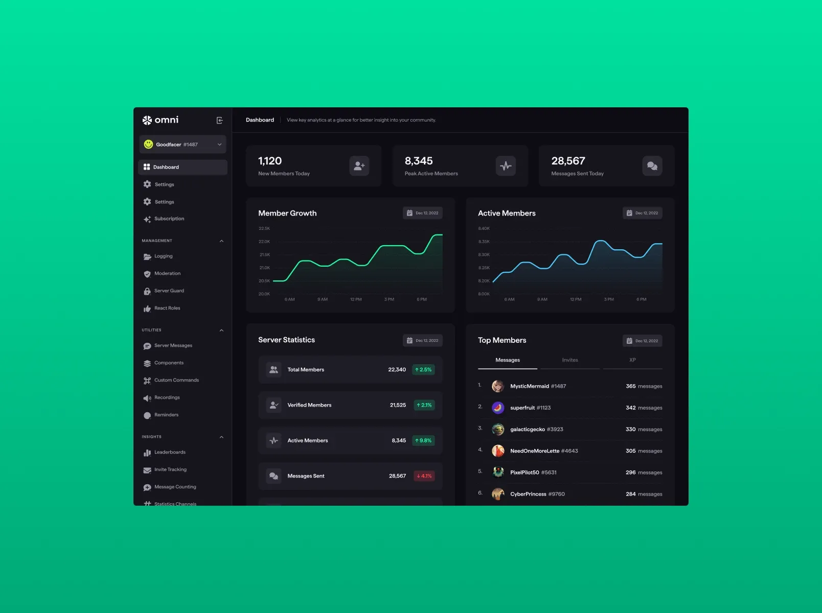
Omni
UX/UI design and web app development for a SaaS-based Discord server management platform
UniferX
UX/UI design and website development for an international distributor of organic fertilizers
Bill_line
Website development, UX/UI design for a web app,
and new brand identity for a digital payment service

 advantage


Fill out the form
or brief with questions



 LinkedIn
 Instagram
Welcome to Goodface privacy notice.
Goodface respects your privacy and is committed to protecting your personal data. This privacy notice will inform you as to how we look after your personal data when you visit our website (regardless of where you visit it from) and other sites we own and operate. And tell you about your privacy rights and how the law protects you.
We may change the privacy policy from time to time to reflect changes to the products and services that we provide and how we process your personal data.
We will not share your information with any third party outside of our organization, other than as necessary to fulfil your request if any."
INFORMATION WE COLLECTWhen you visit our website, our servers may automatically log the standard data provided by your web browser. This data is considered “non-identifying information”, as it does not personally identify you on its own. It may include:
- Your computer’s Internet Protocol (IP) address;
- Your browser type and version;
- The pages you visit;
- The time and date of your visi;
- The time spent on each page;
We may ask for personal information, such as your name and email address. This data is considered “identifying information”, as it can personally identify you. We only request personal information relevant to providing you with a service, and only use it to help provide or improve this service.
We collect information by fair and lawful means, with your knowledge and consent. We also let you know why we’re collecting it and how it will be used. You are free to refuse our request for this information, with the understanding that we may be unable to provide you with some of your desired services without it.
We will only process personal data and communicate with you if:
1. You have given us consent to the processing of your personal data and communicating for one or more specific purposes i.e. requesting products or services from us, downloading material or information from our website or submitting a contact us form.
2. Performance of a contract
3. Where we have a legitimate interest for contacting you in relation to our products and services
DATA PROCESSING AND STORAGEWe only retain personal information for as long as necessary to provide a service, or to improve our services in future. While we retain this data, we will protect it within commercially acceptable means to prevent loss and theft, as well as unauthorised access, disclosure, copying, use or modification. That said, we advise that no method of electronic transmission or storage is 100% secure, and cannot guarantee absolute data security.
Rights and choices of individuals:
- See what data we have about you, if any;
- Change/correct any data we have about you;
- Have us delete any data we have about you;
- See what security measures we apply to your data;
- Express any concern you have about our use of your data;
You may opt out of any future contacts from us at any time. You can do the following at any time by contacting us via the email address given on our website: goodface.agency
Got questions or want to discuss a project?

